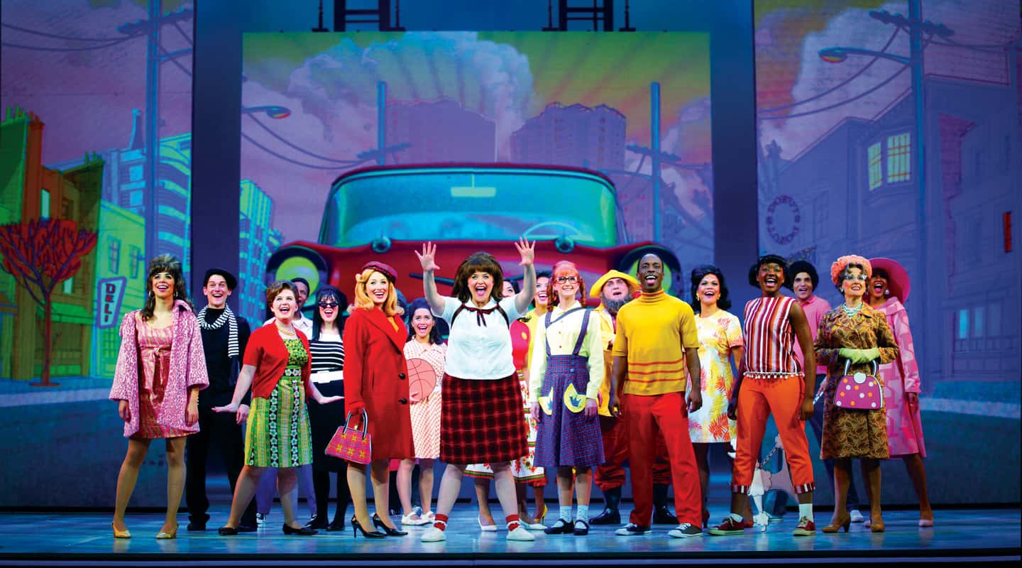
The Brightest Kids in Town
Big Hair and Big Screens make an indelible impression in the exciting Australian production of Hairspray.
Text:\ Matt Caton
When the much-hyped and highly anticipated production of Hairspray landed in Melbourne off the back of its long-running Broadway success, there were many who worried that it may just be another pale imitation of what the rest of the world got to see. However, those naysayers were unaware that the Melbourne production was to be accompanied by a level of technical achievement never before seen on an Australian stage. If you think that sounds like an overstatement, then you clearly haven’t seen the visual feast the Hairspray production team have served up at the Princess Theatre.
It’s hard to imagine now, but Hairspray originated from a not-particularly-successful 1988 film written and directed by John Waters that eventually became a cult classic on video. Adapted for the Broadway stage in 2001, the musical went on to win eight Tony Awards and run for 2500 performances, becoming a worldwide hit in the process. In 2007, a new film version starring John Travolta filled cinemas right around the world and exposed the musical to an even broader audience. But despite its success in both Hollywood and Broadway, this production from Dainty Consolidated Entertainment and Roadshow Live could potentially be the most sensational of the lot.
The level of excellence in all areas of this production of Hairspray is impressive. Quite simply, the show is big; it’s about big themes, with big characters, big dance numbers and of course, Big Hair. However, it’s hard to talk too much about this production without getting excited about a set design consisting almost entirely of multimedia displayed on big LED screens.
From the very first moment you enter the auditorium you are met with a giant 1960s style television. LED strips around the proscenium create a border around the screen, which sets the ’60s mood with black and white clips of I love Lucy, The Twilight Zone, Lassie, The Rocky & Bullwinkle Show, as well as footage of Martin Luther King Jr., JFK and even a young Fidel Castro. At this point you know that you are in for something special, but to be honest, nothing can really prepare you for the visual onslaught that you are about to experience.
THE MEDIUM IS THE MESSAGE
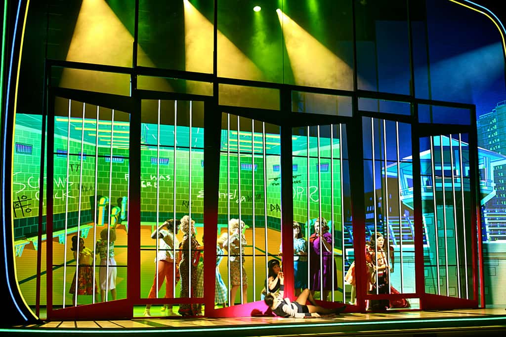
As the show begins, the ‘screen’ splits into three, moves downstage, and eight LED-screen legs come into view. While this in itself is enough to impress, it isn’t until the almost psychedelic animation starts up that the real genius of this design becomes apparent. It’s like being transported into your favourite computer game or cartoon show where somebody has gone overboard with the contrast and brightness settings. Or as an audience member behind me described it, “I think my eyes are having an orgasm.” It makes you wonder how many of the people behind the animation actually spent time in the 1960s; and if they did, it makes you wonder what they got up to!
This ‘media only’ set design was initially conceived by Director David Atkins, who teamed up with Production Designer Eamon D’arcy, Lighting Designer Trudy Dalgleish and Technical Director Richard Martin to take this ground-breaking design from the drawing board to the stage of the Princess Theatre. Dalgleish is very pleased that David Atkins’ vision has been realised so successfully. “The design presentation given at the first day of rehearsals is the show that you see in the theatre today. I think visually the show is ground-breaking and a totally new way of presenting theatre.”
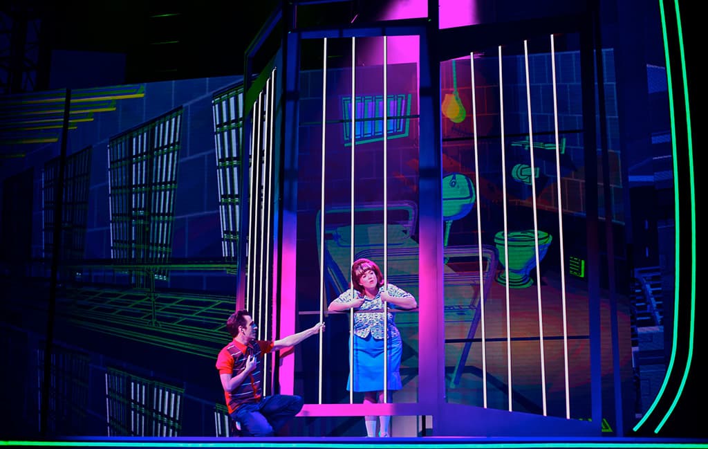
The flexibility that this type of design allows for is unprecedented. The set changes require very few stage crew, and scenic transitions occur as easily as they would in film, with layers of media scrolling up and down seamlessly jumping from one scene to the next. Live video is fed to the screens at numerous points in the show and on occasions characters are even followed around by animated shadows. The screens are also used ‘interactively’, with characters turning off images of light switches and televisions, opening windows, closing doors and at one point, jumping into the animation itself (which I must admit, is the singularly most impressive thing I’ve ever seen in live theatre). No matter how many superlatives I throw at this [and he certainly has given it a good try – Ed], it really won’t do justice to this design.
THOSE SCREENS
The set contains 12 high-luminance LED elements built from VuePix modules. There are four stationary masking legs of 10mm LED modules on each side of the stage and three onstage movable screens of 6mm LED modules. The larger centre-stage screen creates the main backdrop for all scenes. Screen content is distributed in DVI format via optical fibre backed up by a second set of redundant fibres and a changeover system. Apart from one scenic piece flown in during Act 2, the screens make up the entire set.
The three main screen elements move up and down, as well as upstage and downstage via four 22kW hoists controlled by StageOne’s Qmotion system. Head of Automation, Alistair Lee, describes the coordination of the screen movements as “the most technically challenging aspect of the automation process.” In the same way that films such as The Matrix and Avatar were hailed as revolutionary breakthroughs in cinematography, Hairspray will undoubtedly change the way theatre set designers approach their work.
Due to the unprecedented complexity of the multimedia design, it was felt there really wasn’t a media server in existence capable of doing exactly what was wanted. However, as director David Atkins had previously used E\T\C Audiovisuel’s OnlyView real-time multimedia control system at both the Vancouver Winter Olympic Games and the 2006 Doha Asian Games, he considered it to be the best available choice.
Electric Canvas from Sydney supplied the dual-redundant OnlyView systems and undertook all the programming for the hundreds of video cues required in the production. Because the screens are never dark, there are times when the video servers are paused and held in a loop until the musical director uses a foot-pedal to trigger a new video replay sequence at the start of a musical number. The video then runs in lock to the music timecode until the end of the number. Many other cues are called by stage management in the time-honoured manner.
All of the motion graphic content was created by Digital Pulse, while the staggering 2874 individual media objects (made up of QuickTime animations, stills graphics and sound effects) were incorporated into the show by Creative Director of Digital Content, Robbie Klaesi. Robbie, who was responsible for loading the half-terabyte of data into OnlyView, kept the setup of the media server as simple as possible. “The system is split up into two segments to keep it simple. One video server feeds the centre cluster of screens (the moving screens), the other server feeds both sets of legs (left and right).” The live vision in the show is fed into OnlyView from three fixed cameras via vision switcher.
SHEDDING A LITTLE LIGHT
Trudy Dalgleish had the almost unenviable job of lighting a stage and set brimming with high luminance LED screens. “The real challenge was to try and pull people out of such an overwhelming visual and bright background. The show’s content runs like a continuous cartoon that the cast interact in and with so most of the time the cast was only around 300mm to 500mm from a screen. A lot of side lighting was needed that lit the cast but didn’t spill on the screens. We had to run the screens at 6 to 8% to have any chance of seeing people’s faces and most of the time the only light that hits any screen will come from a followspot.” The close collaboration between the lighting and design teams was obvious, with the highly saturated lighting appearing almost cartoon-like, accompanying the media design perfectly.
With the LED screens occupying most of the volume above the stage, Trudy used truss that ran upstage to downstage rather than the conventional across stage arrangement. The impressive rig complements the visual explosion happening on stage with a series of moving fixtures, including a large number of Martin MAC2000 XBs for wash and Vari-lite 3000 Spots. Conventional lighting is via series of ETC Source 4 profiles with LED colour washes coming from 14 Martin 301s and 40 Colour Kinetics ColorBlasts and the cyc wash from CK ColorBlaze units. Two grandMA and two grandMA lite consoles control the entire lighting system, while 10 Jands HP12 dimmer racks provide the dimming. Power distribution for the moving lights and the LEDs is done by 18 x 12-channel 2.4kW Power Distros.
When asked which was her favourite scene in the show (from a technical perspective, of course), Trudy named about four of them. But when pressed to pick just one, it seems the opening number takes the prize “I also love Good Morning Baltimore at the top of the show, it’s great to see people’s faces when they first see the show in its full glory. It’s sensory overload and people are gob smacked!”
It is hard to look much past a set and lighting design of this nature, but I suppose it would be remiss of me, and a little unfair on the cast, to speak so glowingly of Hairspray and fail to mention that the show itself is also pretty darn good!
PRODUCTION CREDITS
Producers: Paul Dainty (Dainty Consolidated Entertainment) and Joel Pearlman (Roadshow Live)
Director: David Atkins OAM
Production Designer: Eamon D’Arcy
Lighting Designer: Trudy Dalgleish
Creative Director: Digital Content – Robbie Klaesi
Producer Digital Content: Tracey Taylor
Graphic Illustrator: Frantz Kantor
Motion Graphics & Digital Effects: Digital Pulse
Technical Director: Richard Martin
Company Manager: Alicia Brown
Automation System: Qmotion
Head of Automation: Alistair Lee
OnlyView system & Programming: Electric Canvas
LED screens/VuePix & Lighting: Bytecraft Entertainment
Bytecraft Systems Supervisor: Andrew Holmes






RESPONSES