Termination: Unicorns, the Tooth Fairy, and the Intuitive Interface
Unicorns, the Tooth Fairy, and the Intuitive Interface.
Text:/ Graeme Hague
There’s the old saying, you “know enough to be dangerous”. What would be the modern equivalent? Probably something along the lines of “you know enough to keep IT support technicians very busy the world over”. In this business? You know enough to make yourself look like a chump. This unfortunate condition is encouraged by the AV industry by means of an irresponsible device known as the ‘intuitive interface’™.
We should really have a decade-long moratorium on the term ‘intuitive’, because manufacturers and developers have flogged the word to death using it for suggesting that any noddy can operate the GUI, the LCD panel, the software… whatever the intuitive device someone has recklessly suggested you can operate all on your own, without supervision and – it goes without saying – without reading the manual (okay, I get that, manuals are for wimps).
REVERSE SWEDISH NOTATION
Just prior to the Dawn Of Time I used to work in a theatre that had a truly evil, utterly-possessed piece of equipment called an AVAB 202 lighting desk. Whoever designed this abomination had serious psychopathic issues, but we can only assume they honestly believed that the data input of the AVAB was in some Nordic way intuitive. In fact, as I reluctantly remember – risking cold sweats and nightmares – the command syntax was kind of backwards (in keeping with its satanic origins) and how you did even the simplest of programming, just didn’t make logical sense.[Like some scientific calculators, it was based on the totally-opaque Postfix or Reverse Polish Notation system – Ed]. It didn’t help that I was an audio technician (now, now…), but this was a regional theatre where the whole crew was expected to chip in for every department including knowing enough about the AVAB to be… well useful, if not dangerous.
You’ll be familiar with the problem of teaching yourself, out of necessity, how to use a bit of gear outside of your normal sphere of operations, but you don’t put your sticky fingers on this equipment often enough that the lessons stick.
Confronted with making the damned thing work, a voice in your head insists, you know how to do this, when in fact you don’t. For the despicable AVAB we all resorted to a laminated list of ‘top twenty’ programming commands that was never, ever allowed to leave the control room. The Dead Sea Scrolls are a mere Post-It note compared to the importance of that laminated list.
In our defense, visiting lighting technicians used to stare at the AVAB in a sort of despair and it wasn’t until we replaced the whole system with a completely different lighting console, relegating the AVAB to being a door chock for the storeroom (where it belonged from the very beginning) that we realised what we’d been dealing with.
THE ILLUSORY INTUITIVE INTERFACE
Fast forward to last weekend at a music festival and I’m chalked up for operating a digital audio console that promises an intuitive work surface. Now, I’ve used this mixer before – about four months ago – so I managed not to bat an eyelid when the road case was opened. Mentally I’m thinking, Ah…it’s that desk. Crap, how does this thing work again? And I made plans to sneak into the venue an hour before anybody else for a discreet refresher course.
Every digital console, audio or lighting for that matter, has an odd quirk or nonsensical way of doing something. Fair enough, what else would we whinge about over beers? Most functions are quite straightforward, but that doesn’t mean you can see them. The sneaky bloody things hide in plain sight, like an optical illusion. And when the pressure’s on and you’re trying to figure something out, the risk is you fall into the trap of over-thinking the problem, looking for a complicated solution when the simple button, fader or menu command is right in front of your nose.
I had a few face-palm moments when my memory cells kicked in and I sorted out some very easy menu functions, after seriously considering taking the desk apart with a screwdriver instead. Which still isn’t my fault, because intuitive should have nothing to do with some kind of polygraphic, ink-blot, Rorschach memory test. Besides, one person’s intuitive interface can be another’s GUI Rubik’s cube.
CERTIFIABLY INTUITIVE
So I reckon we should come up with an Intuitive Interface (II) certification standard and any new product that claims to be intuitive needs to pass some rigorous tests to achieve certification. Does it need offensive language to be operated? Is a printed copy of the manual or a PDF version on a separate device within reach, necessary? Can an audio technician operate a lighting product and vice-versa? (All right, let’s not go overboard). Only once all these kinds of vital prerequisites are satisfied can a manufacturer put an “II Compliant” sticker (which will include some indecipherable small print to make it look proper) on the product and customers can be confident something is genuinely intuitive.
Yes, I know… true genius on my part – please email congratulations directly to the editor. Next issue we’ll be looking at ‘innovative’. Then it’ll be ‘best in class’, followed by ‘ground-breaking’. Put the kettle on, we’re in for the long haul.
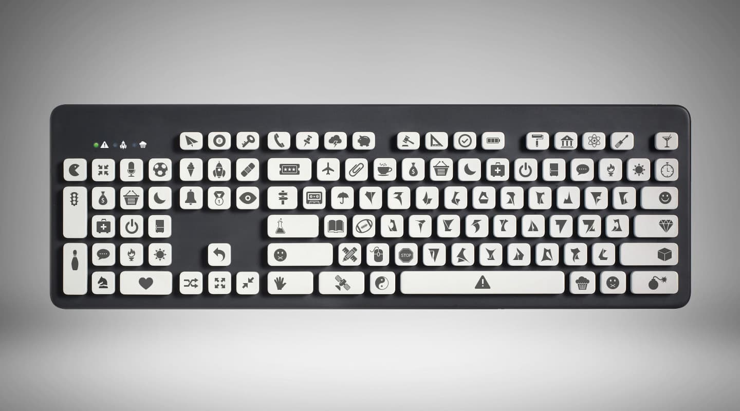
(above) The highly-intuitive interface for AV magazine’s current digital publishing system.


RESPONSES