
Future Learning
Lessons from Monash University’s new Learning & Teaching building.
Text:/ Christopher Holder
Images:/ CHW Consulting
Universities are incubators of new ideas and tomorrow’s leaders. However, challenging conventions and encouraging out-of-the-box thinking can be significantly undermined by the imposed psychological and physical rigidity of traditional teaching spaces. Monash University’s new Learning and Teaching building delivers a step change in learning environments at scale. The 65 formal and 60 informal learning spaces spread over 29,494sqm provides a radically new environment for over 25% of Clayton campus teaching — and there’s nothing ‘safe’ about its design. The building strongly encourages students and teachers to journey together in news ways that Monash believes will help solve the global problems of today.
CAFFEINE & POWER
The new Learning & Teaching building has been fully adopted by the students. The building has been designed for students and their power-hungry, wifi-voracious, caffeine-intensive needs. What’s more, unoccupied teaching spaces are available for students to work in or simply sit in.
I spoke to Monash Uni’s Myles Fenton, who’s business card title reads: ‘Capability Manager Audiovisual’. His team lead the AV design on the project, providing the glue between the Office of Learning and Teaching, the architect, the builder and the contracted AV teams, including CHW consulting and Rutledge AV as the integrator.
Myles Fenton: “One of the guiding principles was ‘student agency’: students have to feel empowered and comfortable to make their own decisions. They’re adults, they’re sitting in a space for three hours… if they’re waiting for permission to do everything then it’s not going to lead to great outcomes.”
That ‘agency’ might start with students being easily able to duck to the loo or have quick access to a latté, but it translates to the use of the AV. Myles has an anecdote that sets the scene for why the AV approach is a bit special:
Myles Fenton: “I was in the Learning in the Round not long into the start of term and I saw this great student-generated drawing displayed on the big screens. It was a graffiti-style Linux penguin in a tux that the student had drawn on the perimeter whiteboard. [Sharing the whiteboard content is as easy as pressing a button.] It made me think: the power balance within the room has shifted. This was a computer programming workshop; students were working in groups and a demonstrator was walking the room, as you might expect. But everyone was comfortable enough to have that student artwork up on the main system — something unthinkable in another place or time. Previously the displays would only show teacher content and student work by exception and then only after the teacher had granted permission from the teacher’s control panel — a hurdle rarely overcome.”
The anecdote demonstrates the push and pull of the new approach. The design and AV is actively encouraging (and, in some cases, forcing) the educator to step out of their comfort zone, and actively encouraging the student to participate, share and collaborate.
Nowhere is this more evident than in the design of the Learning in the Round.

MAP TABLE
A number of rooms have a Map Table. Students and teachers can set up demonstrations at defined locations on the table. Press the appropriate button and the teacher can share the demonstration to the room via an overhead camera — like a document camera on steroids.
DROP DOWN OCTAGON
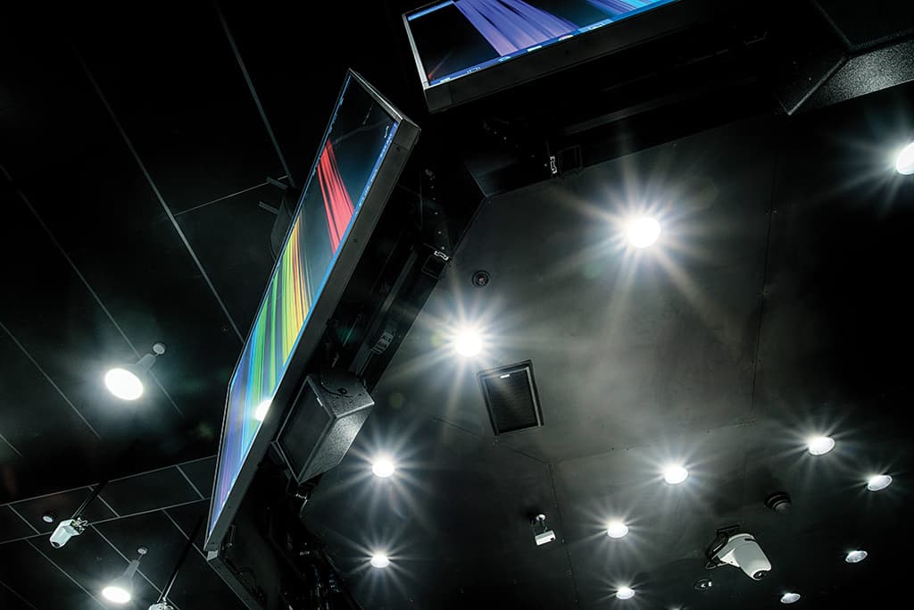
The eight screens plus the rigging amount to some 1.5 tonnes of display. They will drop to the floor at the push of a button for servicing purposes. Push the button again and it returns to it original recessed position — great design and engineering.
ROUNDING OUT
When Myles Fenton and Professor Kris Ryan (Academic Director, Education Innovation Monash University Office of Learning and Teaching) sat down to brainstorm the notion of an in-the-round learning space they were drawing on some ancient wisdom:
Myles Fenton: “It goes back to the knights of the round table, where no single person is in the ascendency. There’s a lot of sound psychology and pedagogy behind round teaching environments and there has been no shortage of attempts.”
Myles and Kris set about examining other examples of in-the-round teaching, and, not to put too fine a point on it, where everyone else had gone wrong.
Myles Fenton: “The common shortcoming we saw time and again was where the displays were positioned. All eyes would be on the presenter in the middle of the room then heads would need to turn to see the AV presentation. Or they’d have to look clear past the presenter to a screen on the other side of the room. In other words there’s normally fundamental lines of sight issues which create a disconnect between the focus on the presenter versus the content.”
The Monash Uni solution is ingenious: an array of 98-inch screens takes care of the ‘disconnect’. A round, central ‘map’ table sits underneath. Four floor-standing preview monitors allows the presenter to always be connected to the content without obscuring any student sight lines. Maintaining the central focus is a high-spec EAW loudspeaker system.
Myles Fenton: “In our research we encountered a lot of distributed in-ceiling audio solutions which don’t cut it. It just sounds like the voice of God booming around… there’s no connection with who’s speaking.”
Of course the other well known audio issue with round spaces is that, well… they’re normally an acoustic disaster area.
Myles Fenton: “We had the space comprehensively modelled for speech intelligibility. We have acoustic treatment above and below the whiteboards around the perimeter of the room and incredibly dense acoustic treatment in the ceiling. The whiteboards are obviously highly reflective, so we’ve tilted those up so first reflections go into the acoustically treated ceiling. In the same way the octagon of screens are tilted down, both for better sight lines but also to break up those acoustic reflections.”
Added to that, you have high-spec EAW loudspeakers that are selected primarily for their tight, controlled dispersion patterns.

SPLIT ALLEGIANCES
Myles Fenton: The principle of the split lectern is it’s something that doesn’t invite standing behind. On one side there’s a document camera and the other side a preview monitor. The combination provides a level of continuity and comfort for those who have never taught in these new rooms. But on the flipside, being split, you need to get out from behind the lectern. Evidence suggests that simply by walking back and forth reduces anxiety in the academic, helping to slow the pace and lower the heart rate.

TOUCHDOWN!
Myles Fenton: We intentionally put the AV touchdown points in a corner of a room [pictured]. It would be an absolutely terrible spot to teach from, and that’s the point. So we put a basic portable lectern on wheels which is something the teacher can place a wireless keyboard and mouse onto and that encourages them into the room — they’re out with the students facilitating learning rather than being a ‘priest behind a pulpit’ at the front of the class.
HOT BUTTON ISSUE
The whiteboard perimeter of the Learning in the Round is paradoxically high and low tech. It’s not ‘interactive’ or ‘smart’ it’s simply a board. Where it’s clever is each section has a Sony PTZ camera trained on it. To throw the content of the whiteboard to the central displays requires the simple push of a button under the whiteboard — there are a staggering 26 camera positions in all.
Myles Fenton: “The aim was to have the capability for every student group in the room to hop up and find a whiteboard. It’s amazing to see the room in action with the academic walking the room, discussing the topic with the group, the student group leader contributing via radio mic and pressing their whiteboard button to submit their workings to the rest of the room. The teachers and students are empowered and they’re not worrying about the AV.”
It must have been tempting to find a hi-tech solution with interactive whiteboards.
Myles Fenton: “Interactive whiteboards are ideal when you have a prepared presentation, but they’re not nearly as useful for brainstorming — the technology often gets in the way.”
The accompanying whiteboard button is probably the biggest stroke of genius. Press the button, it lights red and the room sees your whiteboard. Press it again and it returns to the academic’s Powerpoint or whatever it may be.
Myles Fenton: “It’s the holy grail of tech: a simple mechanical button you don’t need to think about. You don’t need to go to the touch panel. You don’t have to navigate it, you can just press a button and continue to brainstorm. Sit and talk to academics about what they like about the building and the’ll mention the buttons. The cognitive load of running a class is high enough without adding the AV on top. The button is perfect.”

HIP HIP ARRAY
Many teaching spaces have what Monash Uni calls a Data Wall. Smaller spaces have a 1×2 array of 98-inch NEC displays, 60-cap rooms employ a 1×3 array while 90-cap rooms extend to four wide. A Crestron multiviewer processor accommodates up to four sources. Additionally, there are four Crestron receivers behind each display to handle four discrete sources.
When the lecturer has the floor, the screens are in presentation mode. In collaborative mode the screens start to really show their flexibility.
Each quadrant can display a MoCOW source (a moving computer on wheels). There are some 186 MoCOWS in the building and they’re a means by which students can quickly wirelessly present something from a device to their group. From there the MoCOW can be shown as a source on the Data Wall. In Extended Desktop mode one computer can drive up to four of the 98-inch screens.

4K: COME CLOSER
The whole building is plumbed for 4K, featuring Crestron DM, Cisco switches and 4K displays.
Myles Fenton: 4K has its place. When we’re asking students to look at things in the micro and then in macro, in other words where we’re displaying content where you can literally put your nose up to the glass of the screen and then take three or four steps back and appreciate what’s on the whole screen…that’s where we see 4K as being relevant. For general use, the viewing distance is so close, there’s little relevance. I think Avixa did the analysis on the point at which you can appreciate all the detail of 4K, and it’s 0.8 times the height of the image — so for a metre-high screen that’s only 800mm away if you want to appreciate the detail. It’s a little counter intuitive. Most people will say they want 4K so people can stand further back, but it’s quite the opposite. Practically it means you need to keep the space in front of your 4K screens clear, so people can approach the screen and fully appreciate the detail. There’s no point packing furniture right in front of the display.
We haven’t gone for interactive screens but I can see how 4K may be useful for those applications, where you can potentially have more fluid, highly detailed annotations.
Then of course there’s the multi-view advantages of 4K. In this building we can have four students wirelessly sharing their screen to a screen — that could be four hi-def pieces of work displayed simultaneously.

GET A ROOM
It’s amazing just how much glazing there is in the new building. From almost any vantage you can see learning on show in any number of classrooms or informal spaces. If you’re still unsure whether you’ve arrived at the right room, the Monash e-solutions team has developed a nifty room booking system based on Concierge room booking hardware. If the room’s touchpanel is green, then students can amble in for any reason. When the room is timetabled for class the display illuminates blue. The only time it’s red is for scheduled staff meetings. “Let’s not have it showing red — keep out! — when there’s activity booked. After all we’re inviting students to come in,” noted Myles Fenton.
AUDIO: CONSISTENCY IS KEY
Ben Clarke heads up PAVT’s technical support department and provided specialist know-how in the audio design:
Ben Clarke: The days of a pair of plastic loudspeakers next to the screen for program and a bunch of ceiling speakers for voice are well and truly gone.
The Learning in the Round was a big audio challenge because of its shape. The reverberant field is just going to focus all the energy back into the centre and there will be various hotspots.
I talk about the triangle of compromise, by which I mean, how much do you invest in the three key aspects of good installed sound and what will give you the best results? I’m referring to: speaker directivity, acoustic treatment and the microphone. A highly directional speaker across a broad band of frequencies won’t come cheap. Extensive acoustic treatment is pricey. Getting a high quality mic capsule as close to the source is also a challenge. The university uses Shure ULX-D wireless across the campus, so that was already settled.
The finished design uses a high-directivity device (the EAW KF394) mounted above each display in the octagonal array. Then we worked on some optimisations with Rutledge AV as the integrator to get it sounding as even as possible.
We chose the KF394 because of the enclosure’s spaced pair of 10-inch drivers which help extend that pattern control down into the midrange where the power frequencies of speech are. As downfill we use the EAW VFR69.
The VFR69 has become somewhat like Monash Uni’s workhorse loudspeaker. It’s inexpensive but it’s a timber cabinet. And when teamed with an Ottocanali or Quattrocanali multichannel amp from Powersoft it shares a consistent sound with all the other EAW speakers on campus. The technical ace in the hole is the ‘grey box’ processing block. It means we can get an identical amplitude and phase response in those smaller learning spaces as we do in the high-spec theatres. The grey box means we can implement that filter set into the Powersoft amp natively.
Monash Uni is determined to provide its students with the same audio and acoustic experience regardless of the space their in and EAW’s grey box allows that, even if the speaker boxes are wildly different, all without external equalisation — the integrator can simply load the preset and it will sound optimised, correct and accurate no matter what loudspeaker category is chosen for a particular room or application.
The result? Teachers are telling us the students are more engaged and more able to concentrate on the content. That’s largely because they’re experiencing less fatigue.
AUDIO SPEC
8 × EAW KF394 speakers
4 × EAW QX326B speakers
24 × EAW VFR69I speakers
446 × EAW CIS 300 speakers
82 × EAW SMS5 speakers
6 × EAW LS432I speakers
4 × EAW LS832I speakers
5 × EAW UB12S speakers
8 × EAW UB52I speakers
22 × Powersoft Ottocanali 1204 DSP+ETH amplifiers
10 × Powersoft Quattrocanali 1204 DSP+Dante amplifiers
5 × Powersoft Quattrocanali 2404 DSP+Dante amplifiers
2 × Powersoft M20D-HDSP+ETH amplifiers
39 × Shure ULX-D Wireless Receiver
132 × Shure ULX-D Wireless transmitters
KEY PERSONNEL
CHW Consulting
Daniel Knoche
Manoje Indraharan
Ashleah Davis
Rutledge AV
Chris Collier
Nico van Wieringen
Nick Ryder
Nathan Louey
George Moragiannis
Monash AV Design Consulting
Peter MacLean
Stephen Kainey
Zane Johnston
Myles Fenton









RESPONSES