The Great Pixel Massacre Of 2012
Young Talent Time becomes a dumping ground for unloved pixels.
Text:/ Paul Collison
It’s been over 20 years since Young Talent Time graced our CRT television screens. In its heyday, YTT was a highlight of the weekend for almost every family in Australia. Spawning stars like Debbie Byrne, Jamie Redfern, Danni Minogue and Tina Arena, as well as guest performances by future stars like Nicole Kidman and Kylie Minogue, YTT was a springboard to the stellar careers of many Australian artists. The Ten network recently brought back the format in a fresh new modern look.
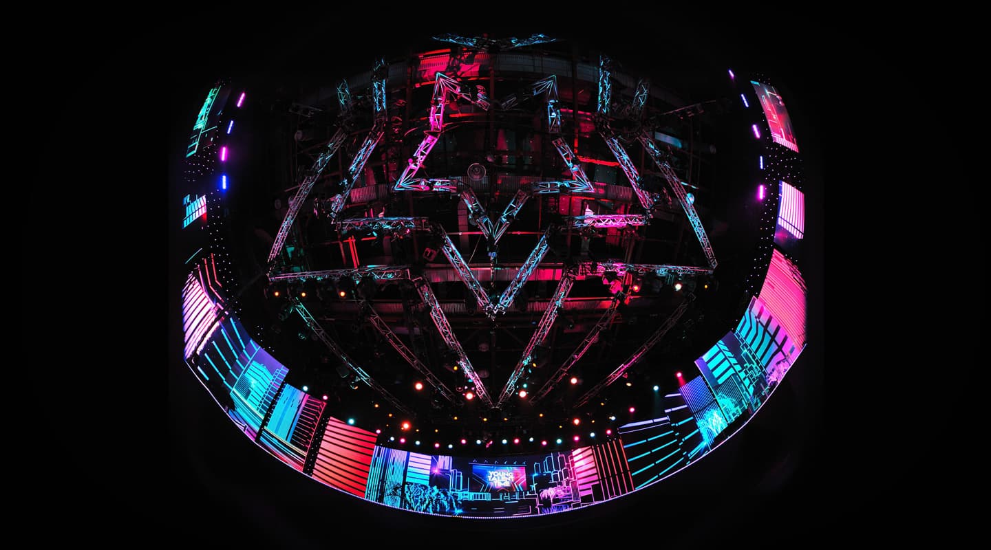
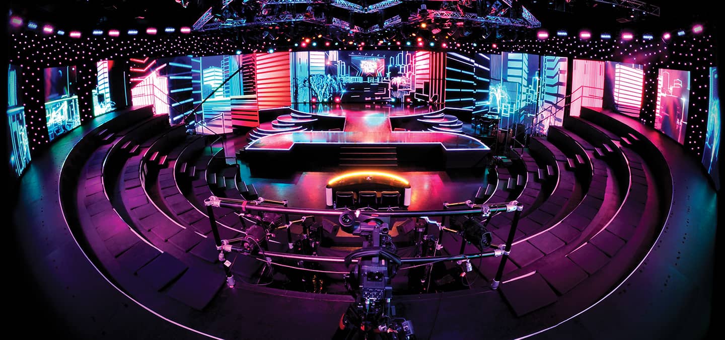
Granada Media, which had been commissioned by the Ten network to produce the show, wanted a fresh, modern look this time around. Enter Eamon Darcy, the show’s set designer, who drew on his extensive theatrical background to bring elements of the theatre into the modern TV studio. Of course a 2012 version was always going to need to rely on technology to help bring it up to audience expectations, so he began by replacing traditional cycloramas and legs with LED screen surfaces, recreating the feel of a theatre. To carry that same look and feel in out into the ‘house’, the LED screen cyclorama continued on, encompassing the entire studio. A set of tiered bleachers for the audience embraced a Y shaped stage, and the set, dubbed the Tina Arena Arena, took shape.
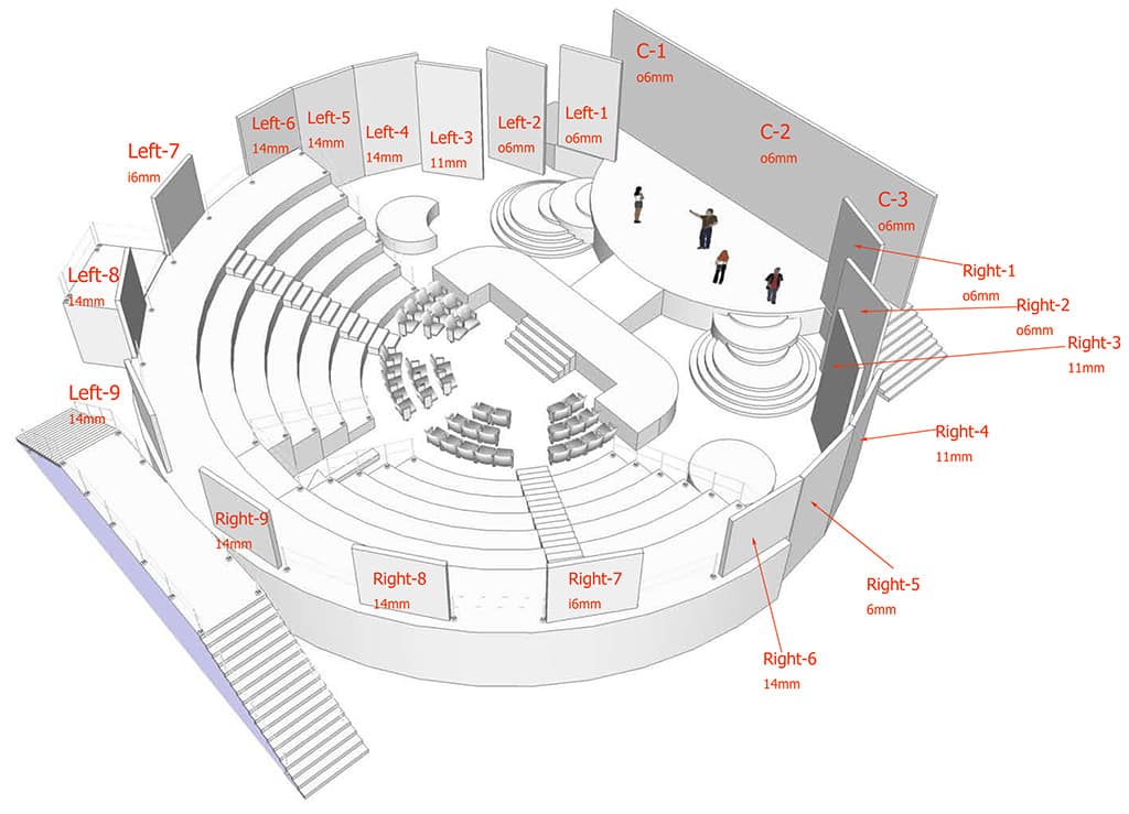
Once the set design was finalised, we had to source the appropriate LED surfaces. In a perfect world, the one type of LED would have populated the entire panorama. Of course budget and the large surface area (some hundreds of square metres), dictated that a variety of brands and pitches would need to be used for the project. Michael Hassett of TDC came to the rescue with a package of LED surfaces to suit the requirements and restricted space. His solution started with 6mm oneLED on the stage area and branched out to various flavours of 11mm and 14mm pitches. The varying pitches were not the most ideal solution, however it did mean that for the most part, the set design was possible, paving the way for our most complex job, the mapping of the screen area for content creation.
TOO MANY PIXELS
The main purpose behind such an expanse of LED, was to enable the creation of a completely different look and feel for each performance. This meant our content creation would play a massive part of each performance. Given the sheer size of the screen surface, it was certainly not possible to use stock content simply mapped to the panorama for every song. A very specific map would need to be created to ensure most of the design work could be done back in the content creation phase, rather than in the media playback system. This map (or template more specifically) would form the basis for the all content design. Creating such a map requires an understanding of a combination of not only the replay system, but also the overall design requirements.
The upstage 6mm oneLED screen was the main focus of the show. It was only 800 pixels high, but 2900 pixels wide. In order to maintain the highest resolution, using a single HD (1920 pixel wide) source would not do. Adding to this was the fact the centre 480 pixels formed a doorway that moved forward and back, effectively creating three different surfaces at times. It made sense to allocate three discrete vision outputs here.
Next there were the ‘legs’ that were also 6mm oneLED – another two outputs. Through the sides and around to the rear of the arena required even more discrete outputs, each additional output providing for finer discrimination of control over the surfaces.
In total, there were 13 discrete outputs that formed the pixel map. Even though there were 21 separate surfaces we managed to squeeze down some of the outputs on to the same template slides, economising on at least some of the bandwidth required for data transfer. The final map was just shy of 11,000 pixels wide, roughly the equivalent of six HD screens lined up side-by-side. By any reckoning, that is a huge amount of information to collate and distribute. The sad irony of the situation was that many of the pixels rendered never appeared on the screen. It’s here things get a little complicated.
MUDDYING THE PITCH
Mapping video content to any surface, whether it’s with projection or LED, can be a stretch for any brain. The real issues in this instance come when you mix various pitches of LED product. In this case we had four different types of LED, at three different pitches. The big challenge comes when placing a 6mm screen next to a 14mm screen. For example, an image that is 100 pixels wide on a 6mm pitch screen occupies a width of 600mm. The same 100 pixels on a 14mm pitch screen is spread over 1400mm. Even though it’s the same number of pixels, the image on the 14mm screen is physically over twice as big.
To get both images to cover the same amount of physical space, it makes sense to render the whole image as if it would be displayed on 6mm screens then simply (and regretfully) throw away those pixels that don’t exist on the more widely spaced 14mm screen. You are effectively only looking at every eighth pixel, as the middle six pixels have literally fallen through the cracks between the LEDs, never to be seen again. We estimate that close to 30% of the pixels rendered for each performance were never used. They were literally spacers for the content that we wanted to see. It might seem like a convoluted process to achieve the required result, but keeping the images at the same apparent scale across the entire panorama was critical.
Once the map was finalised, the content creation could properly begin. Frantz Kantor, a Melbourne based graphic artist, who caught the attention of the producers for his work on one of the most recent productions of Hair Spray, was employed as an artist on the project. Glenn Wilson from my company, Eleven Design, was engaged to take Frantz’s artwork and format it for the screens, adding animation and other treatments when necessary.
“”
In this case we had four different types of LED, at three different pitches
PROCESSING THE PIXELS
Generally the artwork began in Adobe Photoshop, and when complete, was taken in to After Effects to be animated. Throughout both stages, the artists would work with the entire panorama unfolded in front of them. Finally, once the content was completed, it was rendered in to 13 separate movie files, each containing only the information required for a single output.
Lining up the content to screens was our next challenge. Some of the LED processors in the system could scale and position each slide on their own, meaning we could keep the slides untouched inside the replay system and leave the fancy positioning and scaling to the processors. Other screens required the use of a Barco Folsom scaler. The finer parts of the lineup came from the Pandoras Box Media Replay system.
Content was centrally located on a network accessible storage (NAS) device. The Pandoras Box Media Manager would then access the NAS across the network and distribute the content to each of the 13 machines for output. The content would come in two distinct formats.
Mostly it was built to match the audio tracks because of significant performer interaction with the screens. In these cases, the content would then be placed on the timeline within the Pandoras Box Manager to chase the SMPTE timecode running from the Protools audio replay system. If the content was less specific to the audio, then traditional ‘loops’ were created and triggered from a grandMA2 lighting console. The ability to bounce between these two approaches, sometimes within the same segment, made the challenging work easier to grapple with.
YTT in 2012 was a far cry from its earlier incarnation. The ability to create unique environments for each performance was an amazing tool to have in the cupboard for the creative department. Each treatment was painstakingly taken from an idea, then storyboarded, drawn, animated and finally formatted and replayed for the screens. The skill of all those involved certainly made the project a success. Let’s see how much fun we can have if YTT makes a return to our screens in 2013.






RESPONSES