Expo, Expo – Read All About it
Expo Shanghai 2010: an 800-acre AV benefit gig.
Text:/ Andy Ciddor
I recently had the opportunity to do a quick lap of World Expo in Shanghai courtesy of Christie Digital, which is so proud of its huge involvement in the event that it shipped in a group of journalists from around Asia to show off some of the impressive results.
Expo Shanghai is an event on an almost incomprehensible scale. The pavilion area occupies 3.28sqkm (810.5 acres). Of the world’s 196 nations, 189 are participating, together with about 50 international organisations. To that, you can add pavilions for the odd Chinese, English, French and German city or region, some Chinese government-themed pavilions, and a bevy of large corporations. With about half a million people visiting the site each day (that’s the total population of my home island of Tasmania), it’s necessary to queue for up to six hours to see some of the more popular pavilions. Given those numbers, it’s pretty clear that my three-day visit, even doing some pavment-pounding 12-hour days, was never going to give me much more than close-up looks at a few pavilions and some fleeting glimpses of the big picture.
For me, one of the most interesting aspects of Expo was the diversity of reasons that the exhibitors had for being at Expo. There is no doubt that commercial pavilions such as Coca Cola and China Mobile were there to spruik their products to the Chinese public. Some countries were clearly seeking to develop a relationship with the rapidly expanding Chinese consuming public, selling themselves as a tourist destination or as a purveyor of desirable products. Others, such as the City of Liverpool and the French region of Rhone-Alps, were there primarily to act as launching platforms for establishing business relationships between companies in their region and companies in the burgeoning Chinese economy. Some pavilions carry a strong message about their country’s contribution to world technology or culture, while others seemed content simply to say how good life was in their corner of the world.
There were some countries however, that seemed completely unsure why they were there. Take the Irish pavilion for example. This is a beautifully designed and genuinely relaxing space to visit. There are some clever uses of simple AV technology, some excellent graphic design, and photographic murals. My favourite experience was a deceptively simple wall consisting of hundreds of apparently uniform 16×9 format panels. Some panels were simply well-photographed backlit transparencies, others were LCD video display panels showing HD footage, while others were actually display boxes containing items of produce or objet d’art. All the panels were lit at the same colour temperature and featured similar levels of brightness, contrast, and colour saturation, which gave the display a unity of design, but a huge diversity of content. I had plenty of time to look at the panels, because I was one of only a few dozen people scattered around the multilevel pavilion. There was no signage to indicate what anything in the pavilion was about or why it was there, and other than the usual handful of Chinese security guards (there to make sure nobody nicks anything), there was not a single representative of the exhibiting country. I am utterly baffled why the Irish taxpayers had this beautiful pavilion designed and built, or what they hoped to achieve with it.
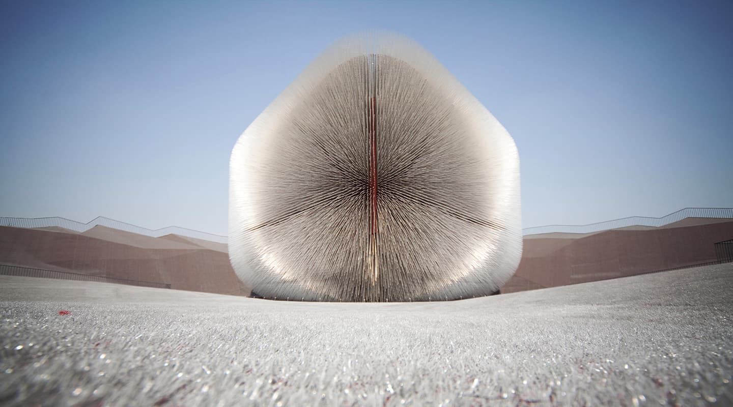
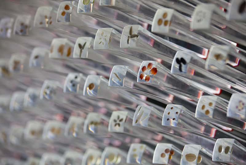
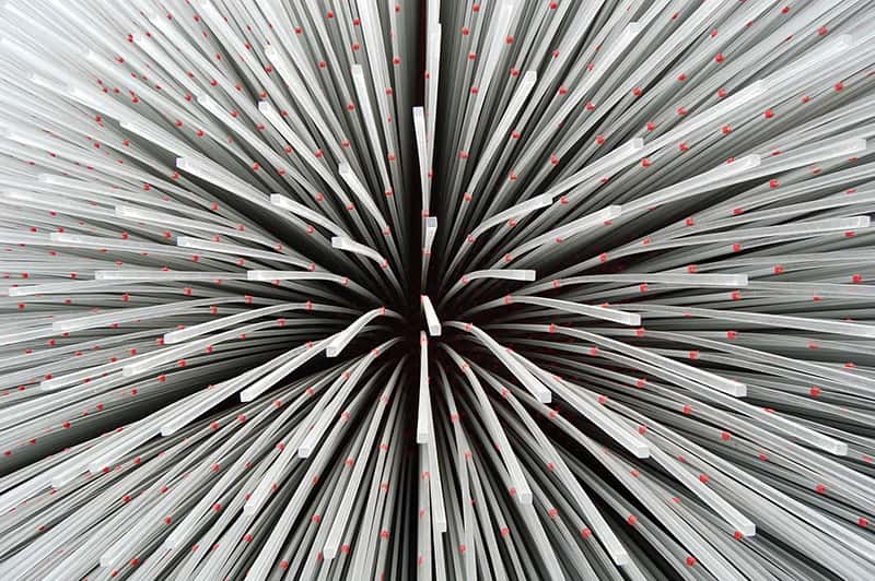
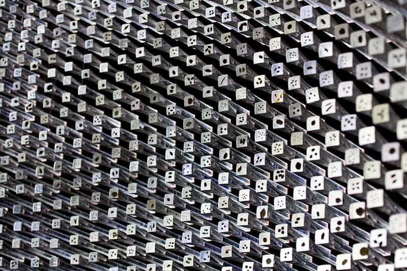
It seems that there’s a requirement for every self-respecting pavilion to have dozens of video display panels and some form of multi-projector and at-least-partially-immersive screen environment. Indeed, it’s almost a statement of cultural independence not to have them. The UK pavilion in creating a pleasant park-like environment for punters to relax on (albeit one covered with grey rubber grass), was either way out in front or way behind the trend. Its astonishing seed pod covered with oversized seed-embedded optical fibres (as seen on this spread) is second only to China’s inverted red pyramid when it comes to recognisable symbols of the Expo, yet there’s not a screen in sight.
There’s no doubt that video display, projector, audio and signal distribution companies were the big winners at an Expo that appears to have been staged entirely for the benefit of the international AV industry. It certainly is worth visiting if you have the chance.
In the pages that follow you’ll find some further fleeting impressions of Expo from that three-day visit, together with those of peripatetic lighting designer, technical consultant and AV contributor-at-large, Paul Collison, who spent many months in Shanghai during the lead-up to Expo as part of the team that put together that spectacular opening concert we covered in the last issue.
Text:/ Paul Collison
The Danish pavilion is one of the smaller pavilions on the huge site. Occupying roughly 3000sqm, the Danes needed to come up with something special to compete against their larger European cousins. Designed with the intention to emote the lifestyle of the average Dane, the pavilion is based on a flowing walkway that twists over and back under itself. A bicycle track, bars and food outlets populate the walk. The centrepiece of the exhibit is the original Little Mermaid statue borrowed from Copenhagen harbour. Strange as it may seem this statue has great significance to the older Chinese visitors as the Hans Christian Anderson story was one of only three foreign stories permitted to be told in China, during the repressive period of Chairman Mao’s Cultural Revolution.
From an AV perspective, it is the subtlety in which the building is lit that is mind blowing. Surrounding the curved façade is a series of circular penetrations that not only allow for air movement and a nice texture, but also become large pixels for mapping textures through video on the façade. The density and size of the pixels varies in a way that is aesthetically pleasing, however their mapping is limited by the structural integrity of the building. In areas where there is significant stress on the façade due to the cantilevering, the holes are less frequent and smaller. Each of the 3580 holes is a Perspex tube from the external façade to the inside. A single SMD LED fitting casts light down the internal structure illuminating the entire tube. The façade extends for roughly 300m. In contrast to the normal Shanghai skyline, and indeed the entire Expo site, the content on this surface shows great restraint and is predominantly variations on white, with a single display including the colour red, at 9pm each night. The building undertakes an impressive transformation on sun down. It is the class and moderation of the programming that separates the Denmark pavilion from its more exuberant peers.
Leif Orkelbog-Andresen, Market Manager Architectural from Martin Professional was responsible for all lighting in and around the pavilion. This included point of sale areas and functional areas. Martin would normally not undertake a project like this directly, however given the importance of the pavilion from the Danish government’s perspective, they readily agreed. Would they do it again? Absolutely, except they would hand over the on-site installation responsibilities to others says Leif.
Control of the entire lighting system is via the new Martin MAXYZ Cerebrum. Video is controlled via completely custom media server by CAVI, the Ahus University Centre for Advanced Visualisation and Interactivity, who admit it might have been easier to use an existing media server, but liked the idea of building their own! Light sensors keep track of ambient light levels and pre-programmed states change accordingly. Amazingly there are no technical staff onsite. The system is completely automated, however changes and updates to the control system can be done remotely from Denmark. Any faults are immediately reported and appropriate actions can be taken. It is important to note that in the first two months there have been no faults. Of course the pavilion management can make changes and override the system with their iPhone remotes.

Text:/ Paul Collison
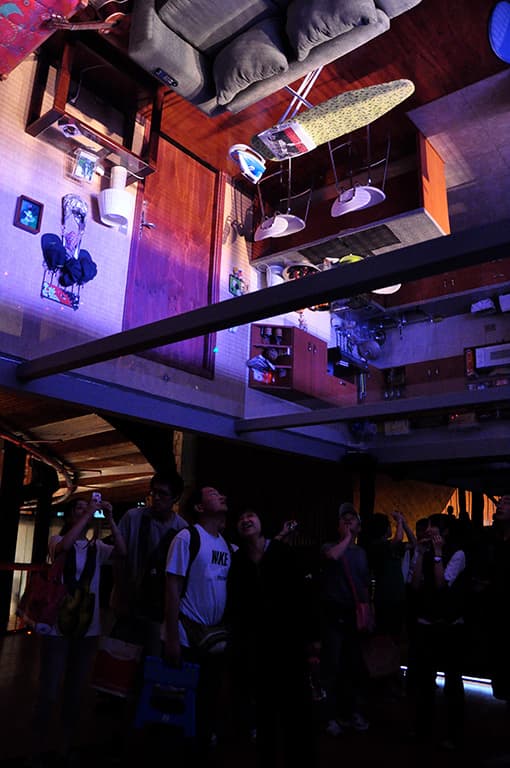
The Chilean pavilion is an extraordinary mix of technology and organic styling, creating a unique experience at Expo. Even the most technological aspects of the pavilion are muted in favour of preserving the warmth and pleasantness of the Chilean culture. The journey begins in a small room with a vertical LCD screen on a wall looking down on to a four-way blended projection surface, one metre below the surrounding catwalk. From the screen, a young Chilean girl looks out to scenic views of her city. Views, which took almost four months to shoot and have now been compiled to show a varied landscape that makes up her country. The four-minute loop can be quite mesmerising. Moving on to the second room you find yourself in the girl’s apartment. However her apartment is upside down above you, taking license from the ancient joke that if you dig far enough you will end up in China. On the wall there are 24 more vertical LCD windows. Day moves to night, as the three-minute video loop again gives you a peek into Chilean homes. The pathway moves on, clad in wood imported from Chile. At no point is the visitor overwhelmed by technology, rather the technology is used to support the narrative from the girl.

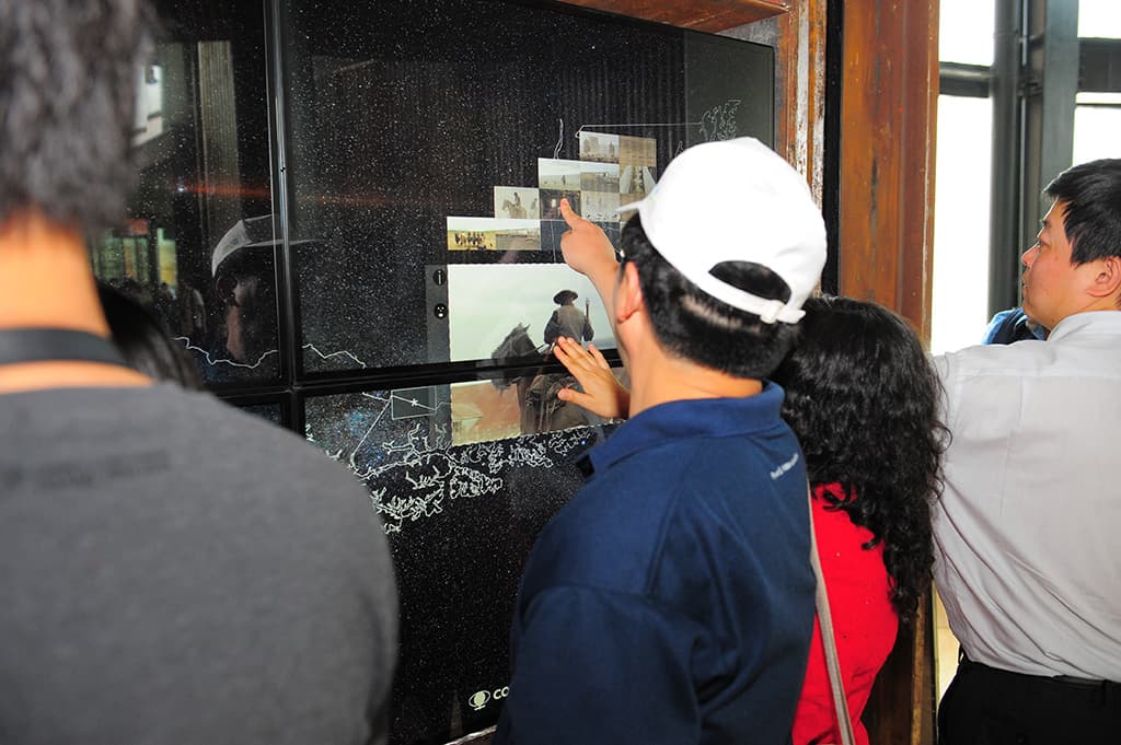
As in other pavilions, the technically exciting exhibits are left until last. The first is Antipode’s Well, a beautifully crafted wooden wishing well encases a horizontally laid LED screen. The screen again takes license from the digging theory displaying live streamed images from a portable camera in Chile. The portable camera goes to bars, football matches and all sorts of daily events in Chile. In return, there is a camera in the well that sends back images from Expo to Chile. This has proved a highlight in the pavilion and indeed back in Chile.
The final wow for the visitor is The Wall of Chile, billed as the world’s largest HD interactive multi-touch wall. At 4m wide by 1.2m high, the wall is made up of eight 46-inch MultiTouch Cells. Designed by Francisco Arevalo of Riolab in Santiago and supplied by Finnish company MultiTouch, the system contains over six hours of HD footage and thousands of still images. Each piece of media can be triggered, sized and moved using traditional multi-touch gestures. Think Minority Report with Tom Cruise type manipulation. Watching the public begin using the system after a short time, it is evident multi-touch technology is something people can intuitively grasp quickly and easily. The back end of the wall is a cluster of high-end computers feeding content for up to 36 users at any one time. The technology isn’t without its glitches and there are moments where the system needs to catch up, however, running multiple HD videos on demand with real-time variables in play is very impressive.
Text:/ Andy Ciddor
Just in case all the other pavilions at Expo were too frivolous or failed to have sufficient educational value, various branches of the Chinese administration sponsored pavilions with serious themes and significant social and educational value to reinforce the Expo’s official theme Better City – Better Life. The vast, and imaginatively titled, Theme Pavilion is one such space. Being intended for consumption primarily by the Chinese majority of Expo visitors, the sections within the pavilion were not named with an eye for marketing, or even clarity of meaning, in English. These themed sections are the Urbanian Pavilion, the Pavilion of City Being and the Urban Planet Pavilion.
Significant planning, design and resources have been invested in these areas, resulting in a well-developed series of educational displays that look thoughtfully at the elements of urban life and the impact of cities on both the economy and the planet. As this is a permanent pavilion, the millions of Chinese school kids who pass through these displays during the 160 days of Expo and the years that follow will be both entertained and informed by some carefully and cleverly designed educational displays and experiences, interspersed with some really naff examples of well-intentioned public education (ie. government propaganda).
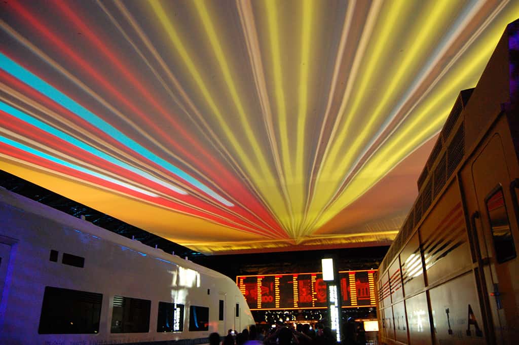
It’s immediately clear why my host Christie Digital brought me to this pavilion. The sheer scale of the displays, some of them designed to be viewed by audiences in the thousands at one time, necessitated significant numbers of high-output projectors capable of long run and low maintenance operation, something that Christie is quite experienced at supplying. However, the number of big-iron projectors in this one building is pretty impressive. In the transportation hall, along with the four full-sized retired locomotives, in a space big enough to house a football match, there’s a well put-together animated presentation about the future of urban rail transportation projected onto the screen that forms the roof of the hall, using no less than 10 Christie Roadster S+20K projectors.
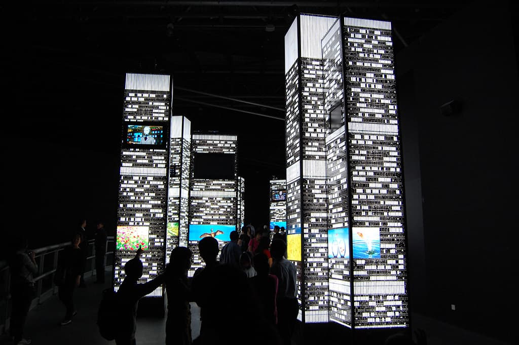
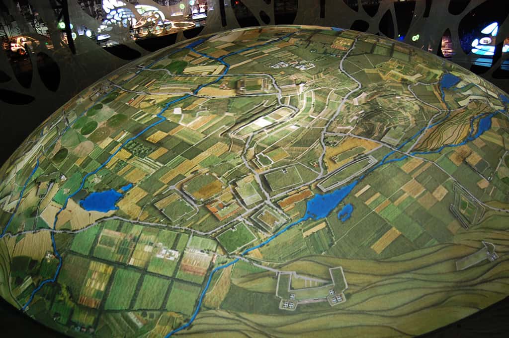
The pavilion includes the inevitable immersive theatre – this one a vast space with seven 15m x 7m screens forming a full 360° wraparound, plus a 19m x 19m ceiling screen. Each of the vertical screens was covered by a pair of Christie Roadster S+20Ks, while the ceiling was covered with a further 12. In fact, for sound logistical and maintenance reasons, the Roadster S+20K is the standard large projector for the pavilion.
The Urban Planet section of the pavilion, by far the best section, is an excellent piece of design, development and construction from Triad of Berlin, which produced an amazingly elegant and absorbing design, based around a pair of interleaved spiral ramps (yes, a double helix). A major feature of this section is the 22m-diameter double-skinned hemispherical screen at the centre of the spirals. This is used to spectacular effect as both the inside and outside surfaces are used for projection. The outer surface, viewed by visitors from above on the ramps, is covered by 13 more of the Roadster S+20Ks fed by a Coolux Pandoras Box system to produce some very convincing planetary effects (check out the videos at www.triad.de). Viewed from floor level, in what is one of the largest reverse dome projections in the world, the inner surface is covered by a further 13 Roadsters running under a Watchout system configured by domeprojection of Germany.
With this pavilion alone having some 67 Roadster S+20K projectors it’s easy to see why Christie set up a special group in Shanghai to support the demands of Expo. It established a register of Christie equipment in use at Expo, from whatever source, whether purchased or rented from anywhere in the world, so that adequate stocks of spares and consumables would be available when needed.
Text:/ Andy Ciddor
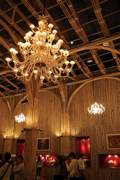
The sense one gets from the Vietnam pavilion is simplicity and calm. After decades of wars to oust its various colonisers and occupiers, this long-time ally of China seems to want to offer itself to the newly middle class Chinese as a quiet, gentle and contemplative place to have a long weekend. One gets the impression that Vietnam would like to become for the Chinese the kind of tourist destination that Bali has become for so many Australians. To this end the pavilion is clad in bamboo, both inside and out – a material that is warm, simple and familiar.
Inside are simple displays of Vietnamese culture and art dominated by two huge statues of Buddha, each sitting in a large reflecting pool, gazing down beneficently upon the punters. To retain the warm tones of the bamboo, and despite the aggressive energy conservation that is a feature of Shanghai’s Expo, this pavilion is uniquely lit throughout by incandescent tungsten light sources. Fixtures used include cheap and simple QI floods, 1kW parcans and glass chandeliers.

Text:/ Paul Collison
The Shanghai Corporate pavilion (or Dream Cube) is funded by Shanghai-based businesses and explores the Expo’s Better City Better Life theme with emphasis on its ‘green’ aspects.
The façade is made from, among other things, secondhand CDs and DVDs. Solar panels on the roof turn sunlight into electricity and then return unused power to the local grid. Rainwater is also collected and used for daily tasks. The façade is, in fact, a 3D LED screen. That is to say, five levels of LED on spines that extend out from the building at 500mm centres (approximately 65km worth). Each LED level is a layer on an M Box media server and, together with the other layers, creates the 3D imagery. It’s an impressive sight. Australian media creators Spinefex developed the content.
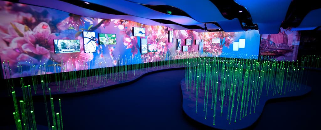
The overall internal experience was designed by Ed Schlossberg’s ESI. The lighting design is by Lighting Design firm Full Flood, under the leadership of world-renowned Lighting Designer, Robert Dickinson. From the top of the first escalator ride the visitor is gently immersed in an interactive world, full of light and sound. Firstly there is the LED ‘meadow’ that changes colour as you run your hands through the LED wands. The walls are adorned with various forms of electronic art. Further on, the intensity builds and the visitors find themselves almost in the heart of downtown Shanghai. The climax is most definitely the 360° interactive theatrette. The dream cube control centre is a mind blowing nine-minute package. The texture of the external façade can be changed by their movement inside. Waving arms change the flow of the content, clapping hands change the texture of it. All good fun.

Text:/ Andy Ciddor
The Pakistani pavilion is a standout example of how poor planning and shoddy execution can produce a truly lame pavilion. If there had never been a previous world expo of any kind, it might be possible to understand how a poor country with few resources and no experience could produce such a travesty. Pakistan is far from the poorest country with its own Expo pavilion and as an exporter of nuclear weapons technology, it’s certainly not a country lacking in technical or design skills. We can only be left to assume that a very bad decision was made in assigning the design and construction contracts for its Expo presence.
The cultural and historical displays appear to have reasonable research behind them, but are executed at such minimal level of competence that the result is cringeworthy. While many pavilions inexplicably feature static images on their walls coming from brand new state-of-the-art data projectors, the Pakistanis have sensibly opted for printed colour images on the wall to tell large parts of the story of their history and culture. However by the time I saw this pavilion on just the third day of Expo, the edges were already lifting on many of the images – they were stuck directly to the walls rather than being mounted on board.

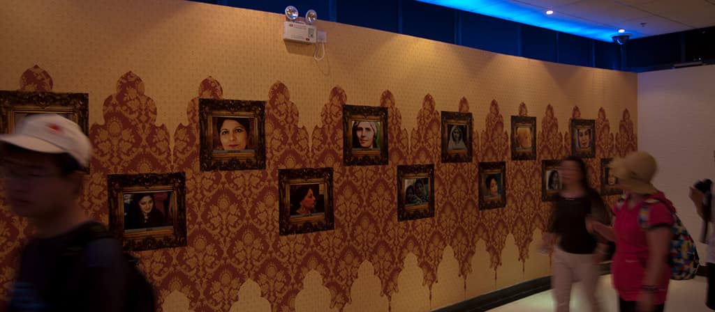
Other signs of half-arsed planning and execution, included floor ‘mounted’ projectors connected using twisted wire and electrical tape left fully exposed to the ravages of visitors for a six-month run. Those same projectors were enclosed in hastily constructed plywood boxes that clearly had already been sat on by tired visitors and now carried a scribbled note on a scrap of paper, asking visitors not to sit on them.
The one section of the Pakistan pavilion that appears to work well is the concession stall area at the exit. The local Chinese Expo visitors seem unable to get their hands on enough ugly brass castings of elephants and camels, crudely-carved wooden elephants or marble artefacts such as bracelets and big dice. Perhaps the concession stall operators had to pay for the design and fitout of the entire pavilion as a condition of their contract.
Text:/ Andy Ciddor
After its well-publicised near-death financial experience at the hands of sub-prime mortgage speculators, Iceland, with a population slightly less than the ACT, went very close to withdrawing from Expo 2010. With only 18 months left to opening day, the decision was finally taken to go ahead with a budget-constrained 500sqm pavilion (half the size that had been originally planned). The result of a national design competition, the pavilion takes the form of a giant ice cube, both inside and out.
The major interior feature of the pavilion is the ice cube-shaped projection auditorium with images projected onto all four walls from Panasonic PT-DZ12000 HD projectors and onto the ceiling via diverter mirrors, from eight smaller NEC NP3250 projectors at floor level. The ice cube theme is further enhanced by the deliberately chilly temperature of the air conditioning system, set to give the audience a visceral impression of Iceland to match with the chilly visuals. The theme of the 12-minute visually-immersive presentation is Iceland as a ‘Cloud Factory’ or ‘Water Factory’ and incorporates a substantial proportion of open vistas of the mountains and glaciers that cover much of the island.
Put together in a four-week shoot by Icelandic television and feature film production company SagaFilm, all material was captured on 4K Red One cameras using a 40mm prime lens for visual continuity between all five projection surfaces. Some of the image sequences were collections of sequences from a location, while others used all five surfaces to fully immerse the audience in an experience such as standing on a glacier or being underwater.

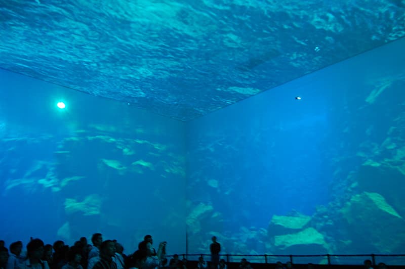
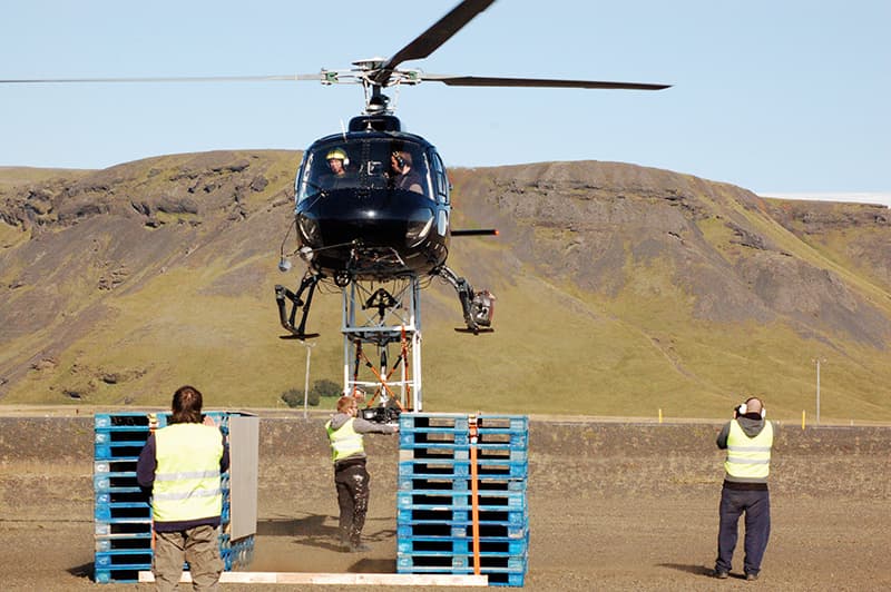
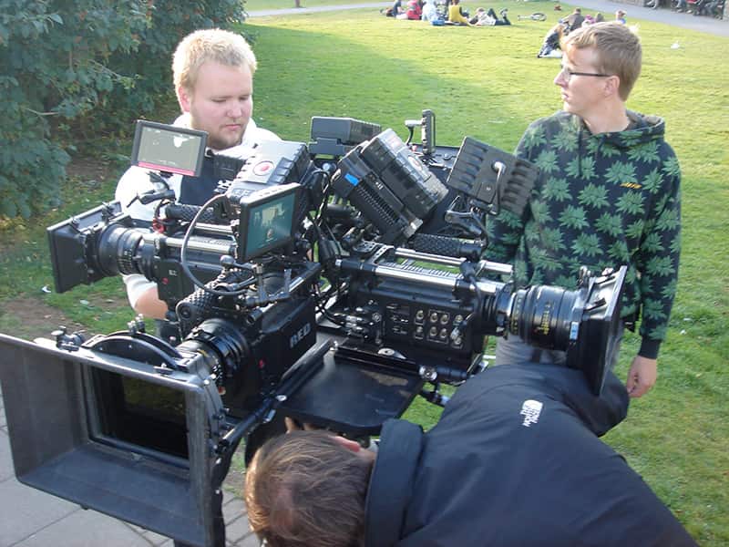
According to director Magnus Vidar Sigurdsson, most of the full five-plane surround image groups consisted of four separate takes from a fixed camera position with the camera (and the crew) rotated 90° between shots. The rig was then reset to the vertical for the sky component. For two shoots, at some of the more complex surround locations and for some moving camera sequences, a rig of four Red One cameras was assembled, and in one case slung under a helicopter (utilising a lot of bungee engineering).
Although many months were spent writing, shooting, editing and assembling the presentation in Dataton’s Watchout, budget limitations meant that it was February 2010, only three months before Expo, when the production team finally had an opportunity to test screen the project at actual size. Unsurprisingly things looked very different at full scale and the project went back into the editing process for a major rework with very little time to spare.
The de rigueur footage of the erupting Icelandic volcano that caused so much grief for air travellers was shot and edited only a couple of days before the start of Expo and dropped into the show as the gates were being officially opened. By the end of the first month of Expo, the number of visitors to the pavilion had already exceeded Iceland’s total population.
Text:/ Paul Collison
The German pavilion is the great grand-daddy of the site. With waits of up to six hours, this pavilion is second only to the China pavilion, in terms of numbers through the door and lengths of queues.
It takes roughly 40 minutes to navigate this 6000sqm structure. Upon entering, there is a 200m semi-indoor pathway with backlit panels full of information about the various regions of Germany. Interesting, but certainly not technically mind blowing. That is until you hit the first escalator and you’re thrust into a world of dazzling magnitude and (most importantly in Shanghai) air conditioning.
Paying homage to Germany’s industrial strengths, there are dozens of product displays of designs, concepts and items from various German companies. There are many interactive video elements that read information from infrared sensors around a person that in turn control elements on a video screen. There are sound- and vision-scapes that keep visitors entertained, all the while educating them on the industries that Germany excels in.

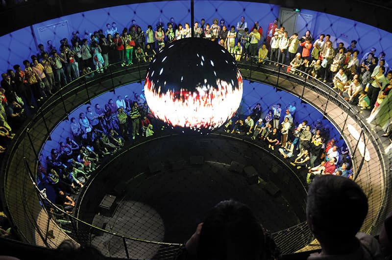
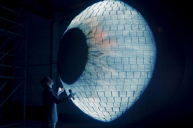
The pièce de résistance of the German pavilion is the multi-level spectacle at the end of the journey. A 1.2-tonne, 3m sphere hangs on a 6.4m pendulum in the centre of the tri-level, round theatrette. The sphere has an X/Y movement that span to 4.8m in diameter in less than nine seconds from a standing start. Covered in 1561, small locally-manufactured LED panels, the sphere, (dubbed the Energy Source) is said to be the source of all energy at the pavilion. The LED panels are an 8mm pitch in a 16×16 format, giving a total count of some 390,400 pixels. With the help of the audience, content is mapped, depending on where the most noise in room is coming from. Microphones are placed around the room reading the sound levels from the audience. The custom interface then sends MIDI notes to the grandMA2 lighting console that controls the grandMA VPU (Video Processing Unit) for specific lighting and video cues. The same system is used to control the movement of the ball via the automation system. The audience is encouraged to make noise to drive the ball back and forth, making no two shows the same. The show’s hosts, Yanyan (Chinese) and Jens (German) are tracked around the circular hosting platform by ETC Source Four profiles fitted with Rosco I-Cue moving mirrors which are driven by a Zac Trac locating system. The Zac Trac system is developed by a company called Zkoor in Austria. Operating in the 2GHz band, it uses eight receiver antennas and a reference transmitter on the performer. The system uses the differences in arrival time of the signals from the performer’s transmitter to calculate the transmitter’s position relative to the receivers. However, this system presently only works to a limited extent. Like all previous automated ‘follow spot’ systems, this one is plagued with problems, as the mirrors move around – constantly trying to locate their target – even when said target is still. This design faux pas really distracts from what is ultimately an enjoyable show. The 12-minute spectacular is definitely the highlight of the pavilion, eliciting responses from the crowd that are unseen in any other venue.







RESPONSES