Review: Martin M1 Lighting Console
Martin Professional's latest foray is into the mid-size console market.
Review:/ Paul Collison
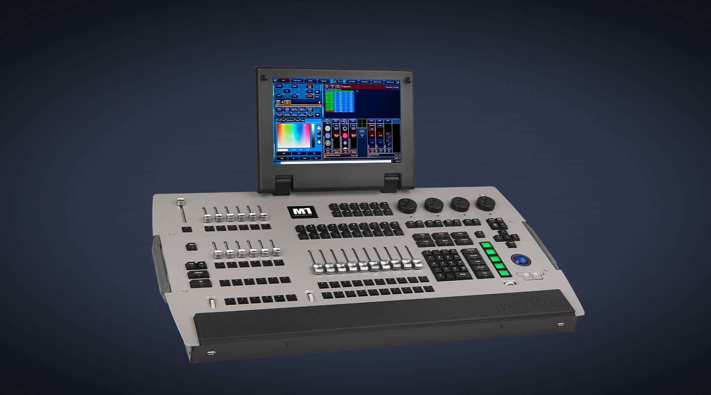
It looks a little like the love child of a Compulite Spark Top, a Whole Hog II and a tin of silver paint. Add a fancy backlit trackball and a Martin badge, and you have the M1 – Martin Professional’s latest lighting controller. Its roots stem back way further than its immediate forebear, the now defunct Maxxyz system and even further back than the Case controller. In fact, the first moving light controller this writer used was a rackmount Martin 20-08 back in the late ’80s. Certainly Martin has come a long way since then. There was a long way to come! But to think of the M1 as a new lighting console is somewhat incorrect. The software derives from the long-developed Maxxyz platform, which was initially plagued with hardware issues, however the M1 seems to have overcome these.
Martin lighting controllers have long polarised many programmers: some love them, some despise them. For sure, this latest one will do the same; however, it is probably one of the most well developed ‘new’ lighting control systems to hit the market of late. After a quick rundown from Simon Barrett at Show Technology in Sydney, the M1 and I headed to the Opera House forecourt for a date with some footballers on the NRL Footy Show Grand Final edition. How romantic.
Before we go much further, we need to understand where the M1 sits in the market. We’re not talking about a console that will control 1000 moving lights. Martin have realised that there is a gaping hole in the market when it comes to reliable, mid-to-low-end controllers. A solid platform that runs 50-odd moving lights, some generic channels and a media server or three, at an affordable price, was needed. With a price point that is very competitive, the M1 is scalable to your needs. Out of the box it can control four streams of DMX via the four 5-pin ports on the back of the console. Simply add a Martin Ether2DMX8 converter to bring that up to 12 streams. For a further small cost, you can unlock all 12 streams and use any Art-Net device. MIDI in/out modules are also optional. This means you don’t need to buy capabilities you don’t need. If you want to expand further, there are ports for Martin Wings and DMX input.
FIRST IMPRESSIONS
The silver faceplate is good and bad. In low light it is easy to navigate, but it will show up dirty hand marks pretty quickly. The surface isn’t cluttered – in fact, it’s quite easy to get going. The layout is good, although I wouldn’t want to be left-handed, given the encoders are far to the right of the surface. Fortunately, Martin has realised most of the universe despise the tractor faders that populated the Case and Maxxyz surfaces. These have been replaced with the chunky rotary encoders that seem to now be standard on most lighting controllers. The built in 13.1-inch touch screen is great, if only a little on small side. I’d definitely prefer two, however, that would also increase the cost. The good news is there is native support for ELO Touchmonitor screens without the need to add any drivers – something more sophisticated lighting control system manufacturers are yet to achieve! So with one of those attached, our outing to the Footy Show Grand Final was much more enjoyable.
There are 10 x 80mm throw faders centrally located with three user-configurable buttons on each. In addition there are 12 shorter throw faders with a single button. The shorter faders are great for flash and trash as the shorter throw allows your fingers to play with more faders at one time. Add in 12 more buttons for playback and it’s obvious there is a lot of real estate on board over the 100 pages.
Now we know we can afford it, what can we do with it?! Well, for a start, it’s light. At only 14kg (not in a case), you can throw it on a plane without huge excess fees. For this show, it travelled in my boot and was carried from the car park to the stage – something I’ve not done with a professional console for a long time. The M1 was allocated three Pandoras Box media players, 16 Chromlech JARAGs and a dozen Martin Stagebars. Not much of a workload, but we filled the four DMX streams pretty quickly.
SO HOW DID WE GO?
The patching process on the M1 is simple and straight forward. This is one part of the software that many console manufacturers either over-complicate or over-simplify. The patching wizard is quick and simple, and seemingly includes almost every fixture known to man – patching our show was very easy. The standard layout views are a winner. Seconds after patching, I could access my fixtures and start programming. Not needing to go back to the drawing board and create every view was quite nice. I eventually created my own single view, incorporating the ELO Touchmonitor, but for the most part, the standard views were acceptable. The tabbed preset window saves huge amounts of real estate without compromising on programming efficiency. The software is stable and functional. With a little persisience (and occasional help) I managed to find most of the features I was after, including the desk lamp control. Thanks Ian.
I found the M1 to be quite an easy console to use. It might sound strange, but it was actually quite a fun console to use. As with most other systems, I’d like a more dynamic GUI. Since both the Windows and OSX operating systems have come a long way with dynamic interfaces, I still don’t understand why lighting GUIs need to be so drab. However the M1 is probably better than most systems I’ve used lately, but still not perfect. The 13.1-inch screen is okay, but for long programming stints I think I would find it too small to consistently navigate. The addition of the ELO Touchmonitor screen would almost be non-negotiable for me to use the console again.
MORE INFO
PRICE
Recommended Retail: $21,999 Inc GST
CONTACT
Martin Professional www.martin.com
Australian distributor: Show Technology: www.showtech.com.au
PROS: SIMPLE & SOLID
The software is well developed. Functions such as cloning, full tracking back-up features, inhibitive masters, sub-fixture profiles and more, show the maturity of the software team building on the development of the Maxxyz console. The M1’s small footprint and low weight mean it’s a very portable console without substituting functions and most importantly buttons and faders. The GUI is simple and easy to navigate. Within a very short time, any user should be able to program and play back cues with ease. Big fat programming buttons combined with the standard ‘clicky’ flash buttons make operating fun and easy.
The hardware is solid and feels great – it feels like it will travel well and last. The software is sophisticated with plenty of features – many advanced programming and playback features are fully implemented. There is an offline editor available, in the form of the M PC, plus iPhone remote and playback apps. The suite of options available is quite impressive. It also does RDM, if the rest of your system is capable.
CONS: GUI NEEDS WORK
Some of the functions of the console are a little buried. I suppose this is rectified with familiarity, but I do feel some things like encoder resolution and even saving the showfile are not quick and easy. I am convinced the touchscreen GUI was developed by someone with extremely good eyesight and very small fingers! I find it a little small and cramped, so the user needs to be very careful to hit the right part of the screen. A more simplified and bigger (see here dynamic) interface would increase programming speed and make the console easier to navigate. Lack of SMPTE timecode is an oversight – MIDI timecode is not a great option, besides SMPTE is much more the industry standard synching protocol. Some of the software needs a tidy up. Things like the ‘Blind’ programmer are accessed by a physical button labelled ‘Preview’ but displayed as ‘Blind’ on the screen?! For the first time in what feels like forever, I had to pull out the old desk tape and pen. The lack of displays around playbacks obviously saves cost, but means the feedback from the surface is inhibited. The on-screen keyboard is too small. A solution like the Windows 7 touchscreen interface where a keyboard pops out from a dock when required, would be a slicker approach.
M1: A1?
Martin Professional is definitely kicking goals with the M1. This is obvious given current delivery times. Martin simply can’t keep up with demand, which is a good problem to have. Once the M1 hardware fully adopts the Maxxyz software and the GUI is modified to suit the M1 layout a little more, this will be a tough lighting control solution to go past. Two thumbs up for the M1. I’m looking forward to using one again.








RESPONSES