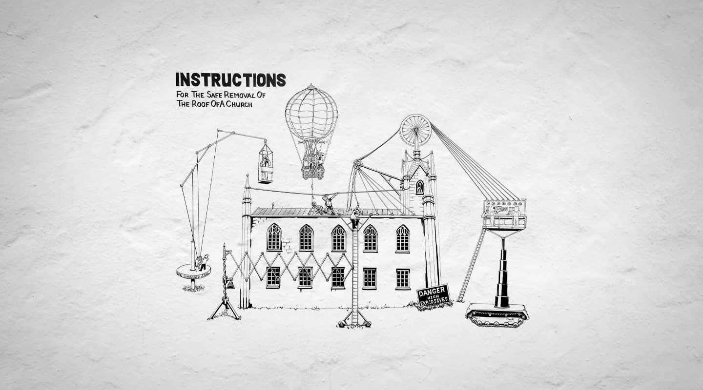
Termination: Keep it Stupid, Simple
Keep it Stupid, Simple
Text:/ Matt Caton
Drawing:/ Pharic McGregor
It never ceases to amaze me how complicated people like to make things. I’m not sure if it is some admirable strive for excellence that drives people, or just a penchant for making themselves look clever by being difficult. Either way, I’ve seen this trend far too often in recent times in areas of live production and performance.
For those who work in an entertainment technology field, it can be sometimes easy to forget that the audience doesn’t pay money, battle traffic and car parking and sit in a venue to watch your work. In fact, it could be argued that the average punter at a live concert or theatre performance wouldn’t even notice the difference if you had decided to not turn up to work that day. It’s a ‘complementary’ field, whereby the technology complements the performance rather than upstages it.
When chatting with a prominent theatre reviewer recently I asked specifically how they review technical elements. The response was interesting: “If I didn’t notice it, then it was good. I barely ever notice if something has excellent sound, or amazing lighting, but I sure notice if it is crap, or totally upstages what is happening in the performance”. Yet with this in mind, we still see unnecessary moving lights, ridiculous speaker arrays and embarrassing large screens in venues and shows that really don’t need or cater for it.
With it currently being Fringe Festival time in Melbourne, I’ve had a wee bit to do with various shows popping up in various intimate inner city venues. One that particularly caught my attention was in a venue I was working in that was hosting three different productions. It seats about 60 people, it comes equipped (to slightly stretch the meaning of that world) with one 12-channel dimmer rack and a basic lighting grid that sits no more than three metres above the stage. Despite this, one of the three lighting designers (the only ‘professional’ one) decided to use a bunch of 1kW Fresnel spots which ended up only about a metre above the actors heads, then threw in a load of dimmable fluorescent tubes, two more dimmer racks and a heap of Par 16s that cut off half of the front row of the audience. I don’t think overkill is too strong a description.
Which in turn reminded me of a time many years ago – well before the introduction of today’s slender flat screen televisions – when a work friend invited me over for a Grand Final BBQ. He was hiring a big screen TV from Radio Rentals, and wanted us all to come over. Once we got there, we realised just how small his lounge room was in comparison to the gigantic television; which was as deep as it was wide, as was the trend of the time. While sitting huddled together, about four feet away from a screen that was burning my retinas, I realised that the experience would have been much better had I just sat at home on my couch, and watched it on my old crappy 18-inch TEAC.
This trend is not limited to one level of performance though, I’ve seen it at all levels. There was the theatre Stage Manager/Engineering Student who tried to change a pulley system (that had been working fine for the first two weeks of the season) because he felt it looked unstable. Only to see the pulley fail and drop a banner into a scene about six scenes too early, on the very night he ‘fixed’ it. I also saw a professional show where a Technical Director ignored the Director’s wish to use a cleverly designed moving chair, that could be secretly ‘walked’ around on stage, and instead created a fully functioning electric motor chair; that failed three nights in a row.
Sometimes it’s best to just accept your limitations, and use them to your advantage. Sometimes, the wow factor is just counterproductive. Sometimes, keeping it simple, is the most effective thing you can do… Stupid.





RESPONSES