The Art & Science of Mona
Tasmania’s Museum of Old & New Art has no tickets on itself.
Text:/ Andy Ciddor
The Museum of Old and New Art (MONA) in Berriedale, Tasmania, is the nation’s largest privately-owned museum and art gallery. The brainchild/ hobby/obsession of its ever-so-slightly eccentric owner, mathematician-professional gambler David Walsh, this privately-funded museum/gallery was built to share David’s strange, challenging and eclectic collection of ancient objects and art works with anyone who cares to visit.
MONA is located in the grounds of Moorilla, Tasmania’s first vineyard and winery that was, against the best-available advice, established in 1958 by newly-arrived Italian migrant Claudio Alcorso, on a peninsula in the Derwent River near the Cadbury’s factory, just 15 minutes’ drive North of the Hobart CBD. Long before MONA was conceived, the Moorilla site was a destination for cellar door wine sales, a fine-dining restaurant and outdoor concerts during Hobart’s short ‘summer’ season.
In 1999, to display some of Walsh’s collection to winery visitors, the Roy Grounds Courtyard House, built as home for the Alcorso family, was converted into the Moorilla Museum of Antiquities. Later Walsh added a function centre, a micro-brewery and a cluster of outstanding architect-designed river-front pavilions (starting price is $490 per night). A well-equipped outdoor stage structure, complete with grid-equipped stage roof, cabling infrastructure, dressing rooms, green room and a function room, was constructed on the spot where temporary concert stages had previously been sited.
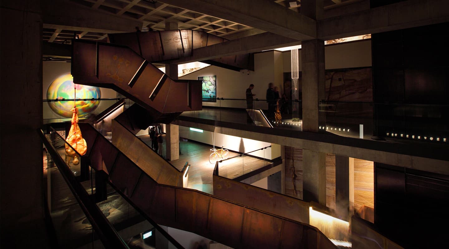
Disappointed with the general lack of interest reflected in the poor visitor numbers for his modest museum, in 2005 Walsh decided to solve the problem in a non-intuitive way, by spending about $50m on a vast new three-level museum. Rather than create a towering monument to his wealth and ego, Walsh had Melbourne architect Nonda Katsalidis design a relatively unobtrusive and site-sensitive building clad in rusting Corten steel and dug into the cliff on the edge of the Moorilla peninsula. Scheduled for completion in 2009, MONA eventually opened its doors in January 2011, just two years late and with a budget that had grown to $80m.
MONANISM
Walsh’s collection, as curated and exhibited in the semi-permanent but ever-evolving exhibition entitled Monanism is confronting, exciting, disturbing and very provocatively centred (vaguely) around the themes of Sex and Death. The title is an unsubtle play on the word onanism, which ties in neatly with David Walsh’s constant references to himself as a ‘wanker’ and the persistent use of the phrase ‘art wank’ in the descriptive materials for the exhibits.
Walsh may be an eccentric, mathematically-gifted nerd, with some fairly unusual quirks, but he does have some very strong, if not always coherent, views about art and he’s prepared to back them with a lot of money. MONA is his strident upturned finger in the direction of all other galleries and museums and the way they think and operate. If you have the opportunity to visit MONA, it’s well worth the effort to be surprised by the strange juxtapositions of the ancient with the contemporary, the accessible with the obscure and the beautiful with the brutal.
This time Walsh seems to have attracted the attention he wanted for his artworks and his ideas about art. MONA has become a destination in its own right, with people trouping down from the mainland (the Big Island, as it’s known to Taswegians), just to visit MONA. The fact that you can take a half-hour ferry ride to MONA from Hobart’s dockside tourist and restaurant precinct adds to the experience. In the 16 months since it opened, MONA has hosted just under half a million visitors, of whom quite a few must have come from out of the state, as the total population of the 335 islands in the Tasmanian archipelago is only about 511,000.
IDIOSYNCRATIC VISION
Being driven by the obsessive ideas of just one wealthy person who doesn’t report to a board or a minister, nor answer to a finance committee, has not only produced an idiosyncratic building dug into the rock of the peninsular and an idiosyncratic exhibition, it has also produced a very singular vision of how technology should be integrated into the museum’s structure and operations.
As it should be, MONA itself is a pretty controversial work of architecture and design, filled with idiosyncratic ways of doing everything from booking, ticketing and guiding visitors, to HVAC, AV, ICT, lighting, displaying artworks, and customer relationship management. Rather than attempting to cover all of the clever and innovative components of MONA, the museum and Monanism the exhibition, I too am going to be controversial. Due to the limited space available in a single magazine article (even if I am the editor), I’m going to offend a substantial proportion of the people who are responsible for the technology, art and magic at MONA, by picking out just a few of the facets that have caught my eye on visits as both a punter and a technophile.
FUTURE PROOFING
During the years that MONA was being designed, constructed and fitted-out there was an unprecedented acceleration in the pace of change in the realm of audiovisual technologies. The most profound of these from the construction viewpoint, was the move from a multitude of analogue signals in separate cables to a multitude of IP datagrams on a single Ethernet. The MONA project also had a relatively unusual restriction in that it was being constructed by excavating a very big hole in in the side of a cliff, then filling it in with a multi-level reinforced-concrete structure, clad in steel. This meant that there could only ever be one chance to run services to many parts of the structure.
The original infrastructure specifications included the provision of as much power as possible to every location and a structured cabling system based around as much UTP/STP cable as could be afforded, to every possible point in the building. However, that was changed after further consultation with engineers and systems integrators, Aegres.
Through their long-standing relationship with other Moorilla projects, and at the request of exhibition designer Adrian Spinks, Aegres had the rare good fortune to be involved with the MONA project from the very outset. This not only gave AV a voice in the project at that early point where it’s possible to get things right the first time, it also gave feedback into the process from the very people who would be providing AV design, support and maintenance for MONA as an operating museum.
The advice from Aegres (which appears to have been right on the money thus far), was to run as many empty conduits as could be afforded, to all the places where there would be no second chance at cabling. Indeed, that policy was extended to virtually all horizontal signal/data cabling infrastructure. As the opening of the museum finally drew near, and the first version of Monanism began to take shape, Aegres made the call to run 1310nm monomode fibre to those parts of MONA that required data feeds. Even after providing fibre over redundant paths to all four server rooms, there are still empty and partially-filled conduits awaiting changes to both the exhibitions and the technologies that will accompany them.
THE CASE FOR THE DEFENCE
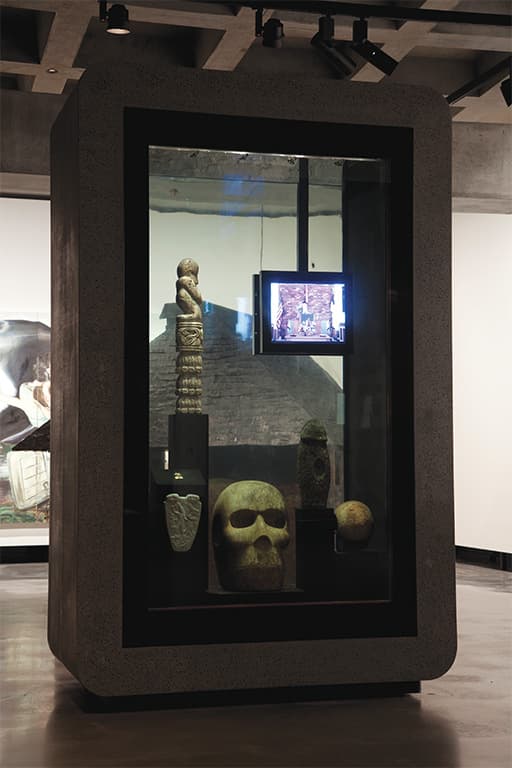
Each of Adrian Spinks’ display cases for MONA is a sealed, self-contained museum in microcosm. The only connections to the display cases are power from an overhead track and an optical fibre connected to the museum’s network backbone. The cases contain an AMX NI700 interfacing with a Luxam 24-port TCP/IP-controlled fibre-optic illuminator, a self-contained temperature and humidity control system, plus all of the necessary surveillance and security monitoring devices required to protect priceless antiquities.
The one exception is a display case, which whilst also hermetically-sealed, is actually filled with water. Included in the material exhibited in this case is a work displayed on an ostensibly-waterproof LCD display. Despite employing units sold as being waterproof, over the 16 months that MONA has been operating, water has nevertheless managed to infiltrate the ‘immersion-proof’ monitors via different paths, on several occasions.
“”
MONA is his strident upturned finger in the direction of all other galleries and museums

A TORRENT OF WORDS
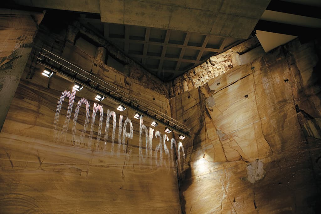
For fairly obvious reasons, I’ve been taken with the idea of the artwork bit.fall by Julius Popp, since the moment I laid eyes on it. Essentially an oversized ink-jet print head attached to a length of standard concert box truss, this device consists of 320 solenoid-controlled water valves (which makes it QVGA resolution, I suppose) that are used to spell out words in falling drops of water. The words displayed are an aggregated feed of material from a group of internet news sites. In the artist’s own words this work is: “a metaphor for the incessant flood of information we are exposed to”.
The water is recirculated from the catchment trough below the jets through filters to remove the accumulated gunk and rock fragments and irradiated by a powerful sterilising UV light source to ensure that the water mist is sterile. Once David Walsh and the curatorial team had decided where this work would be displayed, the excavation contractor was asked to remove another few dozen cubic metres of rock to make an alcove for it. (With little ‘variations’ like that, just to get it right, it’s easy to see how the MONA project’s budget could grow by 60%.)
MONA’S GAME CHANGER
Right from the outset Walsh had insisted that he didn’t want to have labels getting in the way of the objects and the audience in his museum; and thus began what will no doubt be MONA’s great legacy to the entire world of museums and galleries; even those who never hear the name MONA.
Labels are an essential part of any exhibition, enabling the curator to identify the work and provide some information about its provenance and hopefully also communicate why the work is present and how it fits into the context of the exhibition. So how do you convey this information without physical signage?
One tried and true method is to put a simple code number next to each work and provide a written guide, usually the exhibition catalogue, that has matching numbers for the work. There are about a dozen reasons why this is less than ideal, which is why several other technologies have been in use for many years. Other methods still use numeric codes, but equip the visitor with different forms of audio replay device that can play the appropriate audio description of the work in response to the code being entered. While several versions of audio device have proved successful in exhibitions in many countries, their capabilities fell far short of MONA’s ideal.
What Walsh wanted was a device that did much more than any printed label or an audio description, by providing visual content, a selection of optional additional written, visual and audio content, and if at all possible, a way to interact with the exhibits, the museum and even other visitors.
To undertake this quixotic quest Walsh engaged the team of Nic Whyte and Tony Holzner who between them had expertise in both programming and content development and a few ideas about how they might achieve the level of data content and access for such a project.
TESTING TAGS
One big question was how to deliver the relevant material for each artwork. As many portable devices come with built-in cameras, they considered the use of both standard linear barcode and the rectangular QR matrix barcodes, while either would have worked, they would have required visitors to physically access the label with their scanning device, causing problems with traffic flows and detracted from an easy, smooth visitor experience. In the end, a version of the RFID technology used to label freight containers and stolen designer clothing was employed. With an on-board battery capable of working for at least a couple of years, the tags broadcast unique identifying packets of data in the 5GHz industrial band. This allows a constellation of receivers and a very hard-working server to triangulate the location of every one of MONA’s 1340 tagged devices to a radius of a metre or so, which is more than enough accuracy for this application. To maintain calibration of the system there are also number of tags discretely fixed to the museum’s walls.
Once a location system was selected Whyte and Holzner, now calling themselves Art Processors, had to find a portable device to deliver the content that was being assembled. When Apple released the fourth generation iPod Touch with its 324dpi screen, they realised that their wishes for a suitable platform had been fulfilled. The touch-based interface, high-resolution screen, application development platform, quality audio output, wi-fi networking, broad community familiarity and acceptable aesthetic were a good match to their requirements. At this point, Scott Brewer an experienced iOS developer, joined Art Processors to build what would become the ‘O’ application.
PUTTING THE ‘O’ IN MONA
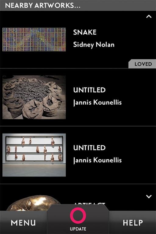
The ‘O’ device, as the modified iPod is now known, is handed out along with a lanyard and an optional headset to every visitor on arrival at MONA. By touching on the screen’s O icon the visitor requests an update of the iPod’s contents to reflect the objects that are currently visible. By scrolling the list the visitor can select the item of immediate interest and learn lots about it, read some Art Wank about its significance and possible meaning or interpretation, listen to an interview with the artists (clearly not possible for the antiquities), or vote to Love or Hate the art work. Where exhibits are films or videos, the streamed audio for the work is made available through the O.
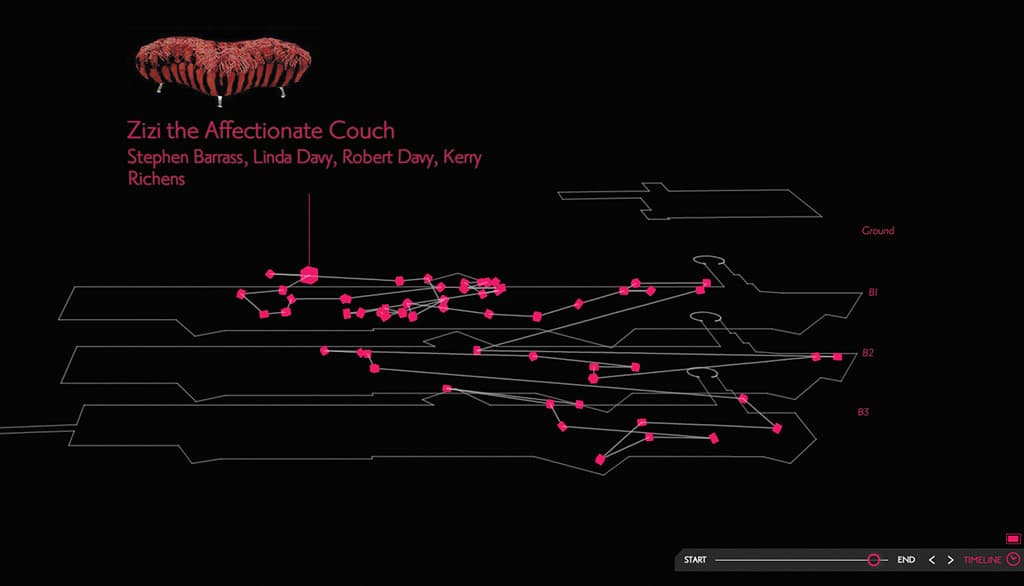
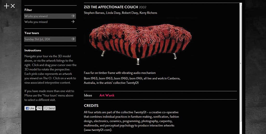
If you are brave enough to enter your email address into the O, you are emailed a link to the MONA website with a step by step record of your visit displayed on a 3D wireframe model of the museum. You can then revisit all the O material – what you saw and the exhibits you didn’t see. The tradeoff is that MONA will send you emails about forthcoming exhibitions and events.
Instead of merely replacing labels, the O device and its attendant systems have provided a means of profoundly expanding and extending the visitors’ relationship with MONA. As an almost accidental by-product, it provides MONA with a customer relationship management platform and a system for tracking every visitor’s movements to evaluate the quality of the display design and identify the most popular and most overlooked exhibits. The O device has proven so popular that quite a number were stolen during the first few weeks of operations before security procedures were revised.
Art Processors were given some very good business advice and have turned their three years of work on MONA’s O device into a platform that locates visitors, manages and delivers the content of the portable devices, provides users with a post-visit web experience and delivers detailed visitor analytics. The Art Processors partners are now off around the world showing their package to museums, visitors’ centres and art galleries. It’s only a matter of time before the O device surfaces with another name and different payload.
SEEING THE LIGHTS
The universal use of Luxam’s fibre optic-based lighting systems for all small objects and many of the larger ones is both clever and an exceedingly obvious approach to providing the right photometric quality of light in concert with the total control required for lighting in the dramatic theatrical sense on a microscopic scale. Luxam’s ranges of fibre-sourced luminaires that provide the same families of tools I’ve used to deliver lighting on the stage and in the studio, make me want to try my hand at lighting design on the miniature stage. In the hands of MONA’s resident lighting designer Adam Meredith, these fixtures have been used to remarkable effect on exhibits throughout MONA.
Although I haven’t the space to give voice to my excitement at meeting the fibre optic profile spot the size of my little finger and Meredith (the designer who wields them so spectacularly in museums around the world), we will have the space for a full feature article in the inaugural issue of Alchemedia’s new publication, Light+Design that will be available later in the year.
I’ve barely touched on the design of the building and completely ignored the beautiful architectural lighting that works so well with raw limestone, rusty Corten steel and glass of the building. I haven’t even mentioned the highly-sophisticated AMX automation system that controls and closely monitors the entire musem and its exhibits, and I’ve ignored a huge number of interesting exhibits that exploit or incorporate clever and interesting AV. Let’s face it, I was doomed to failure from the outset on a project of this scale and significance. If you want to know more, come down to Hobart on any day but a Tuesday, and look around for yourself.






RESPONSES